Citrix Receiver
About this post
Citrix Receiver is a client software that provides access to virtual desktop and apps from any devices. Citrix WorxHome is a mobile app that also provides access to enterprise wrapped mobile apps. This post is about the interaction design on new generation Citrix Receiver that integrates above two products as an unified HTML5 base access point across multiple platforms and devices.
Virtualization
Virtualization, in a simple statement, refers to create virtual softwares such as desktop and applications in centralized servers and provides end users to access those softwares remotely.
Citrix Receiver is a client software that provides access to virtual desktop and apps from any devices, including laptops/desktops, tablets, and smartphones. It contains 2 major pieces:
A client to navigate and access virtual services
(You could imagine this’s a door.)An environment to use the virtual services — This’s the “in-session”. (You could imagine this’s inside of the house.)
This post is about the client, first one. You can see another post about in-session here.
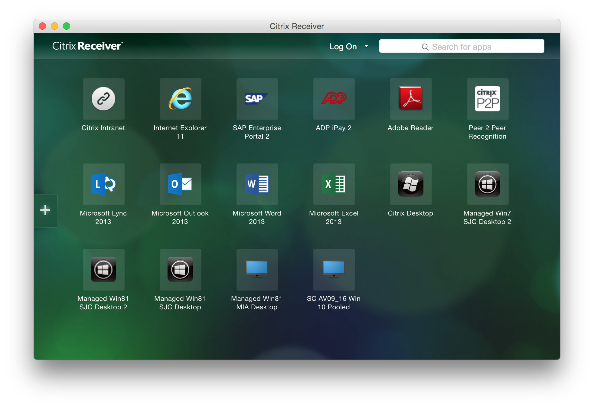
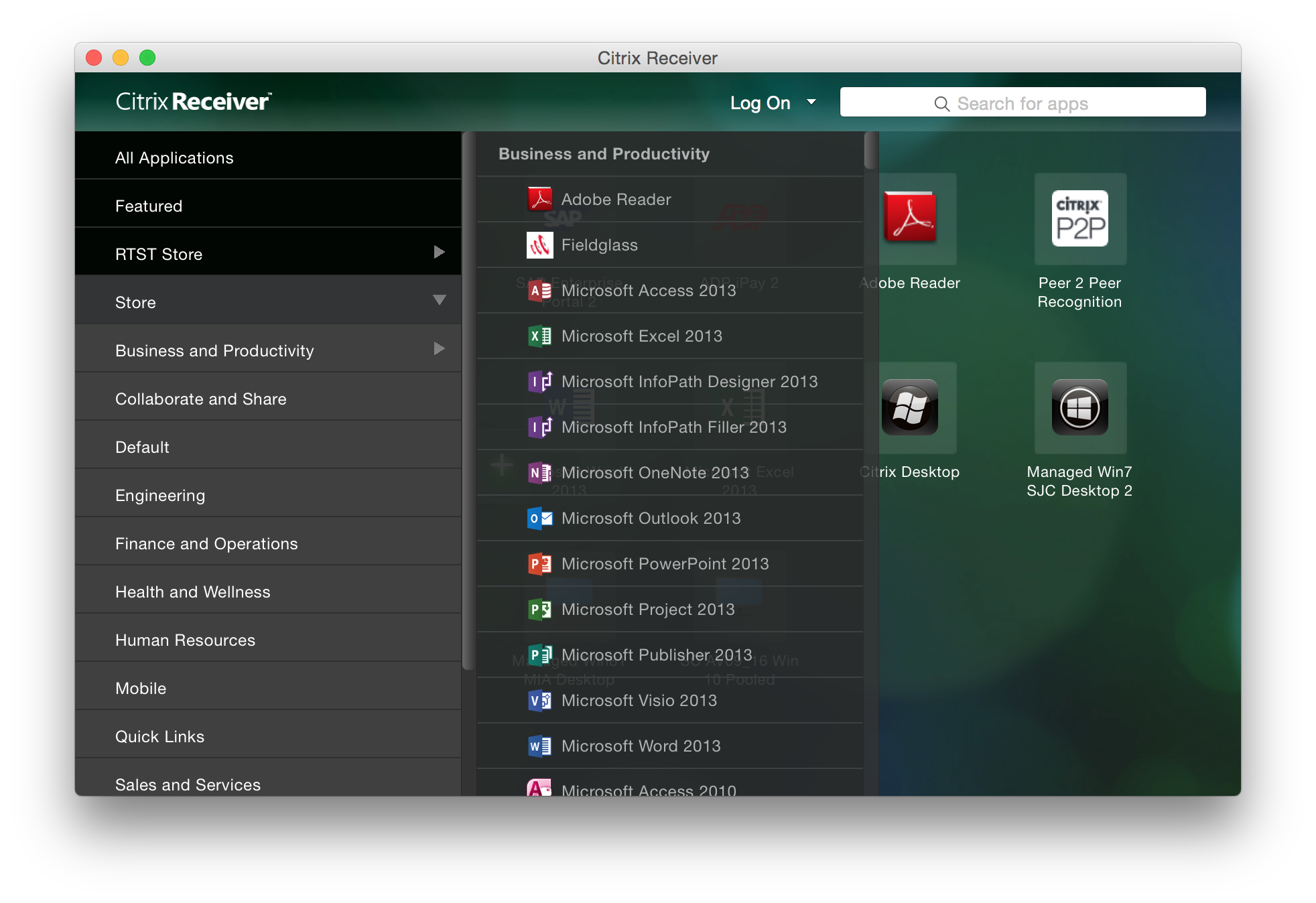
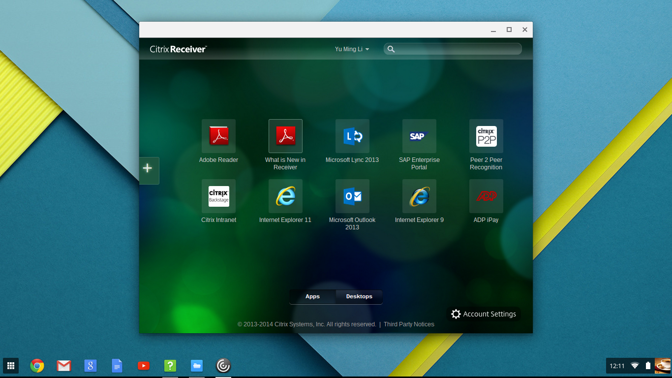
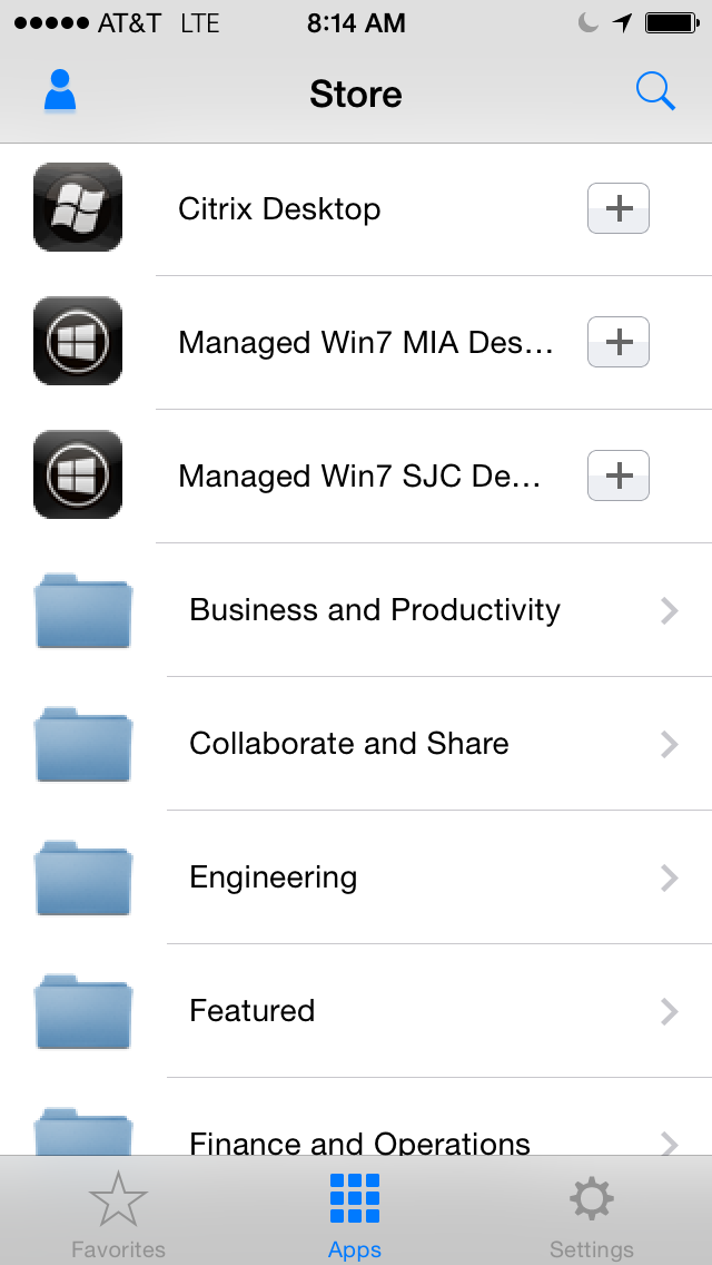
Here are some screenshots about legacy Citrix Receiver:
Problems to be solved
Not only Citrix Receiver, Citrix WorxHome is also a client end access software for enterprise mobile apps.

More and more customers adopt both Citrix virtualization and mobile device management (MDM) solution. Their end users now have 2 different access points. Some services crosses both, such as virtual desktop, and this interoperability actually causes confusion. It makes sense to look at these as a big picture and unify user experience on these access clients across multiple platforms and devices.
Designing a software navigation behavior supposed not too difficult. The challenge is to cover flexibility and scalability for different customers’ needs according to their infrastructure and industries. For example, IT admins can configure the virtual services to end users in 2 main categories:
Subscription
Users can choose the apps they need in an app-store-like library. 3 sub-categories under this:IT admins defined mandatory apps
IT admins keep available apps visible but users might need to request if the licenses are not enough
IT admins keep all apps available on-demand
Non-subscription
Users can only use the apps that IT admins deployed
Both categories can involve desktop, desktop applications, and mobile apps. Mobile platforms, such as iOS, Android, and Windows phone, can access all services. Desktop platforms, such as Windows, Linux, and Mac, can only access non-mobile services.
Besides, multiple-account use cases exist. Some users, such as contracted clinicians in multiple hospitals and clinics, might need to switch accounts among those companies’ services.
Above are all the use cases we need to consider.
Design Approach
The project had been running for half year when I took over. The status was urgent as it was going to be the keynote in Citrix global partner conference Synergy but many behavior and interaction designs hadn’t been finalized yet.
Concerning about the sensitive timeline, I decided to take following approach:
Reviewed current implementation with the lead architect on the project,
Brainstormed with researchers and designers on what the best experience we’d like to see,
Wireframed ideas, and started discussion and iteration loops with develop team.
The architect and develop team are in UK and product design team is in California, USA. We almost ran the project side by side together.
Considerations
The first version was based on HTML5 that can be adopted across platforms. It was one implementation for all cases. That said we need to consider both mouse and touch behaviors along with dimensions on portrait and landscape mode.
Furthermore, client end user experience is controlled by server end configuration, which is StoreFront, one of the XenDesktop components. Coherent design and corresponding considerations across both client and server were required.
Here is the information architecture:
I. Primary Navigation Structure
Apps
All apps - Overview on desktop applications and mobile apps
Featured bundles - Featured app groups
Categories - Apps categorized by type, license, or department needs, etc. logical structure that IT admins defined
Desktops
Favorites - Users’ choice
II. Primary Interactions
Browse apps/desktop
The structure mentioned above
Details
Contextual search
Sorting & filter
Apps/desktop tile information
Icons
Name
Category
Rating & review
Main actions: Open, add to favorite/spring board, request, cancel request
Status
Request in process
Unavailable in desktop devices
Account & store settings
Used to specify service server address. In some cases, an user might have multiple stores to access, e.g. a physician work in multiple clinics and hospitals.
Help: IT announcement, FAQ, help desk information, etc.
About: Version, legal notice, protocol security level
On-boarding experience
Plus animated transition
III. Secondary interactions in Details
Open apps/desktop
Favorite/unfavorite
Restart desktop (Desktop only)
Apps/desktop detail information: Description, screenshots, reviews
Rate & comment on review
IV. Customization
Customers can rebrand this new Citrix Receiver to look like their own product as usual. Many end users actually are not aware of that they are actually using Citrix products.
Logo
Primary and secondary colors on background, title bar, action buttons, folders in categories
Help
Interaction
Here is the interaction design that documented above considerations:

(Click to enlarge)
As an user experience designer, I believe I have responsibility to design optimized user experience. I usually paint a vision and sell to all stakeholders. I document rationales of concepts and considered factors in discussions.
However, in reality, we always need to compromise on timeline and resource to phase features wisely according to business goal. This’s why you will see many areas marked in red stripe: Those were the designs every stakeholder loved but couldn’t be implemented in first release.
Visual
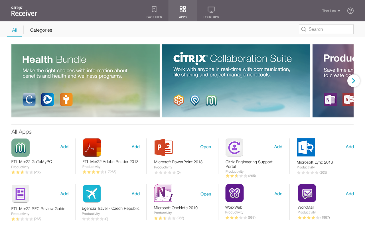
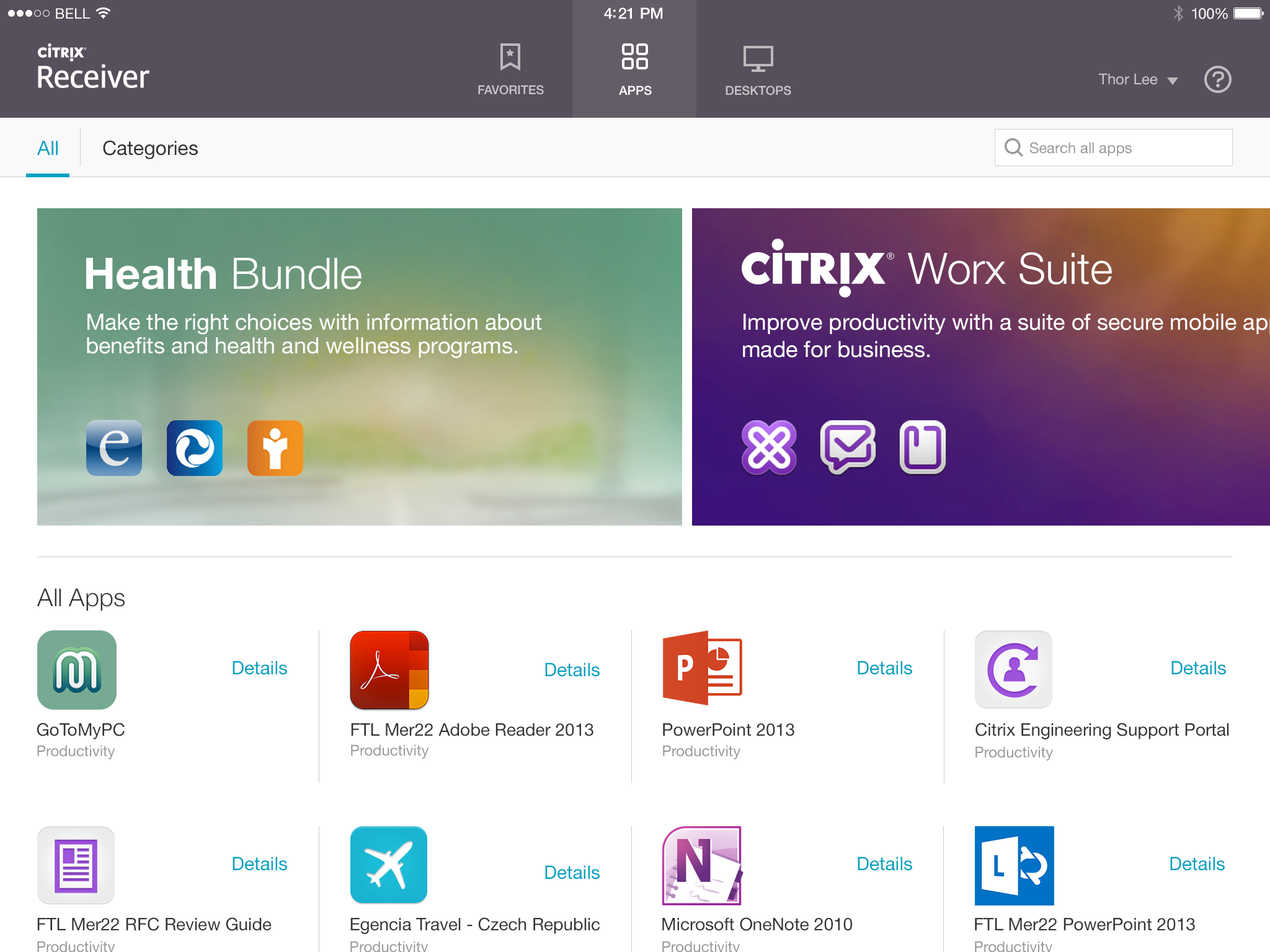
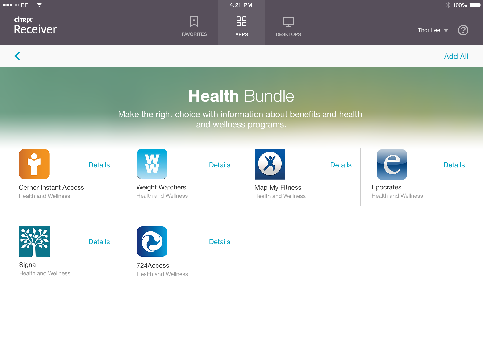
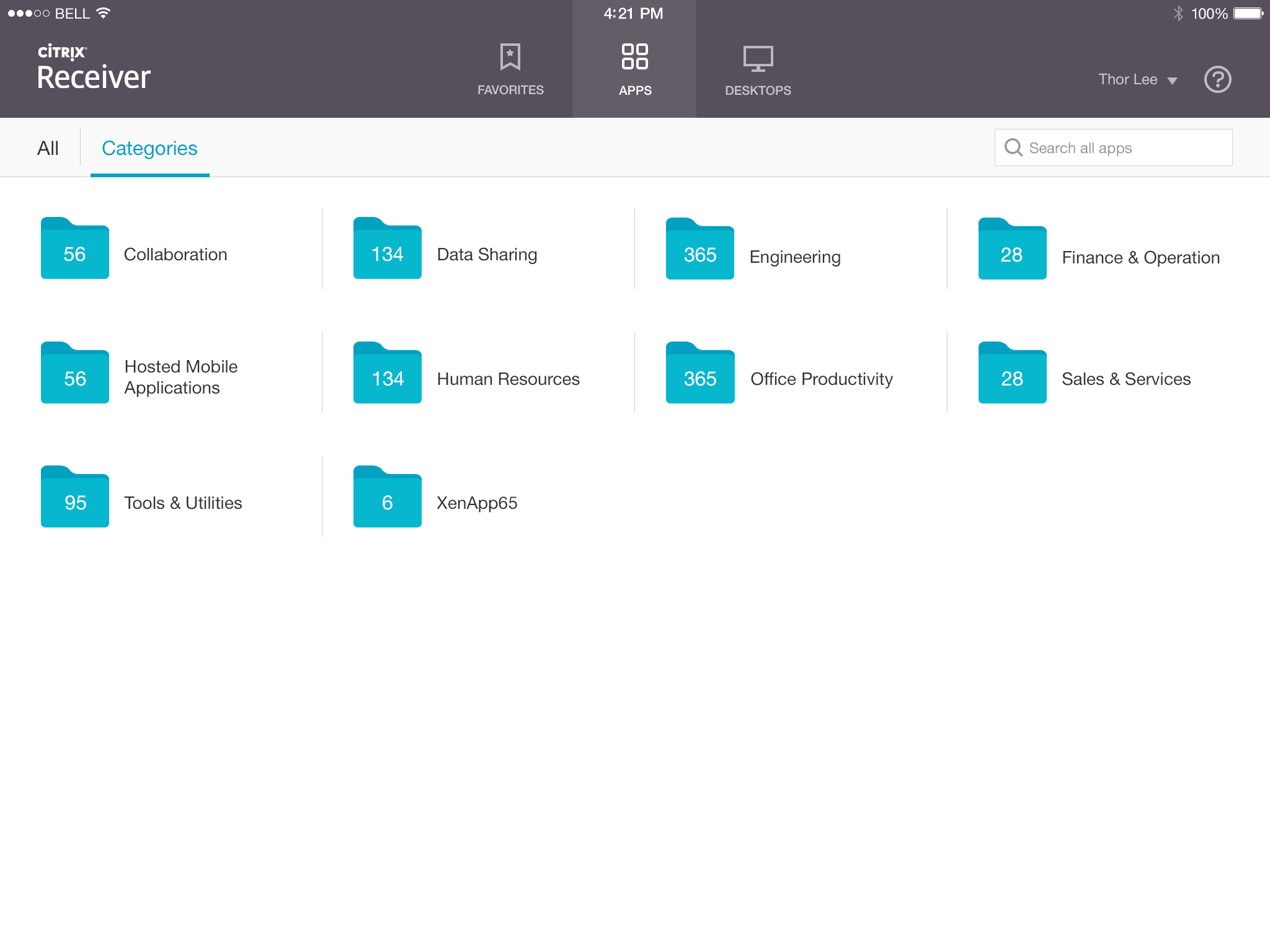
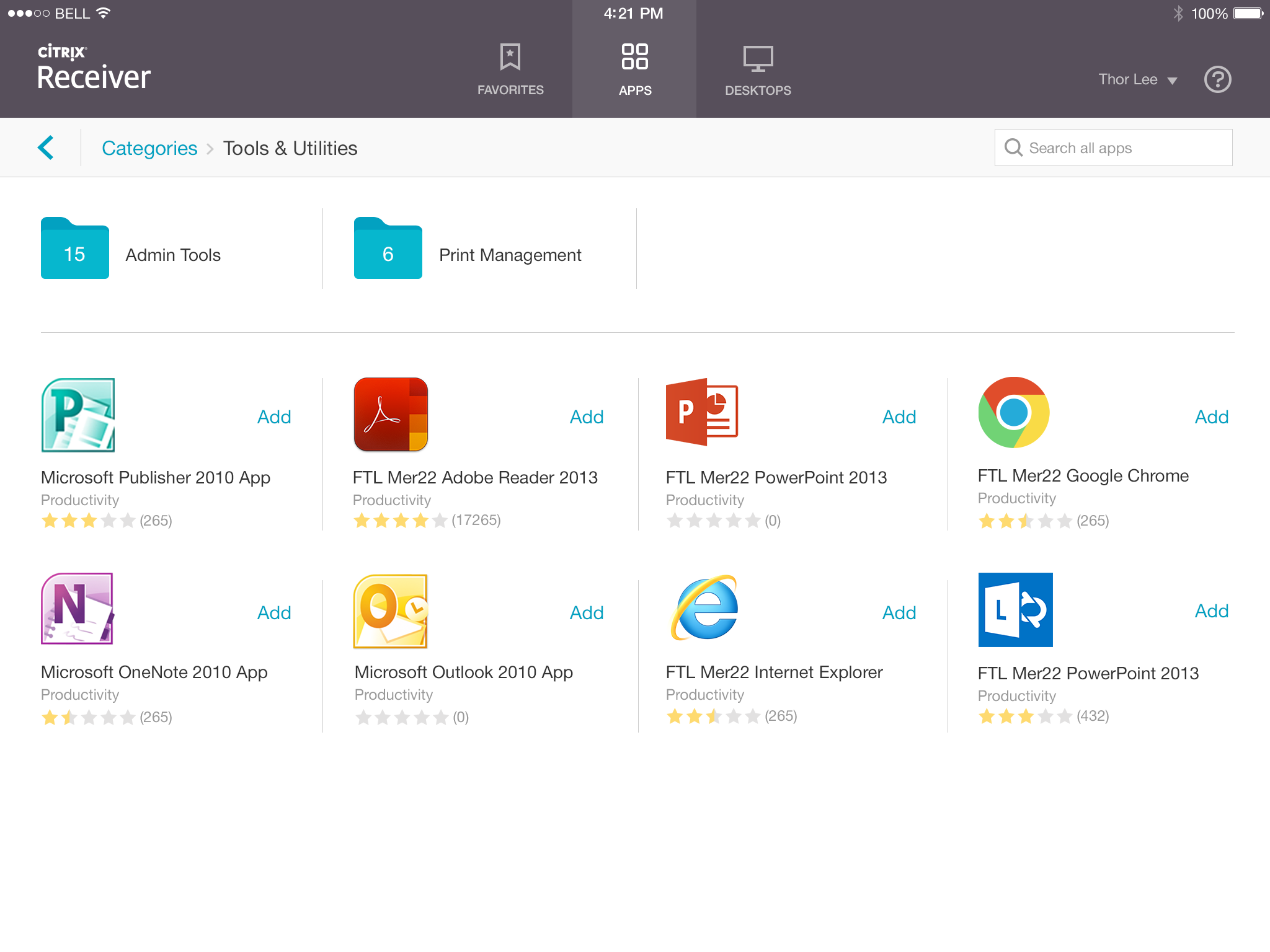
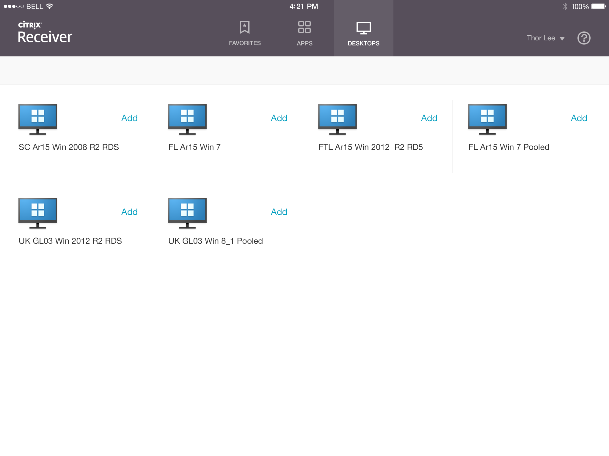
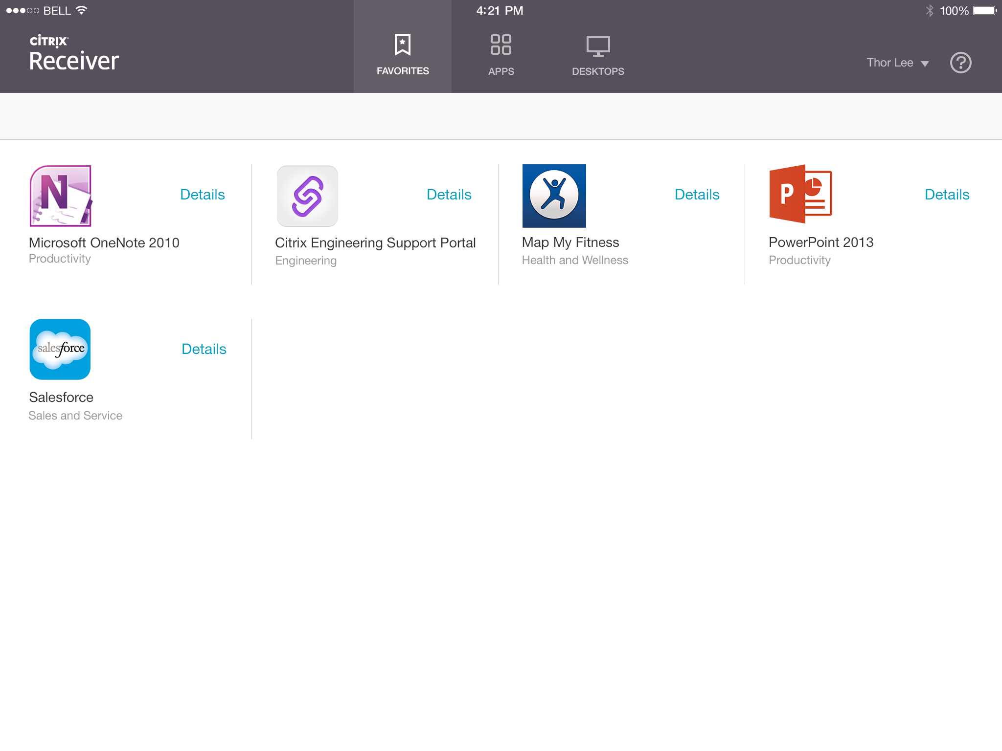
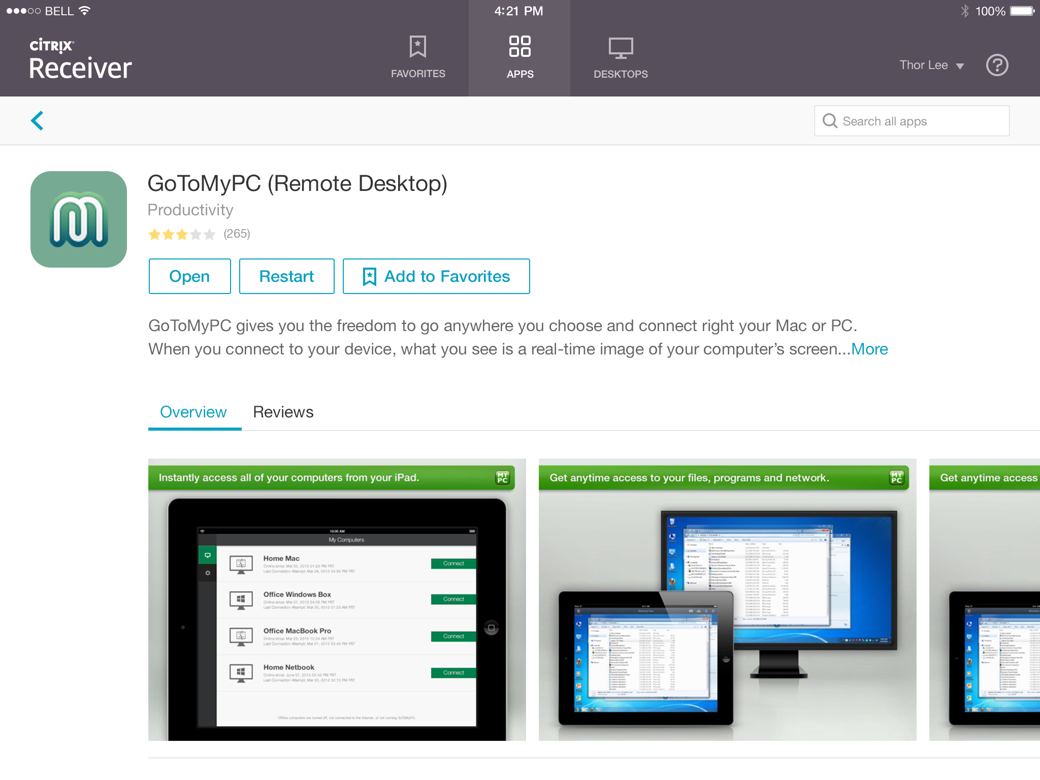
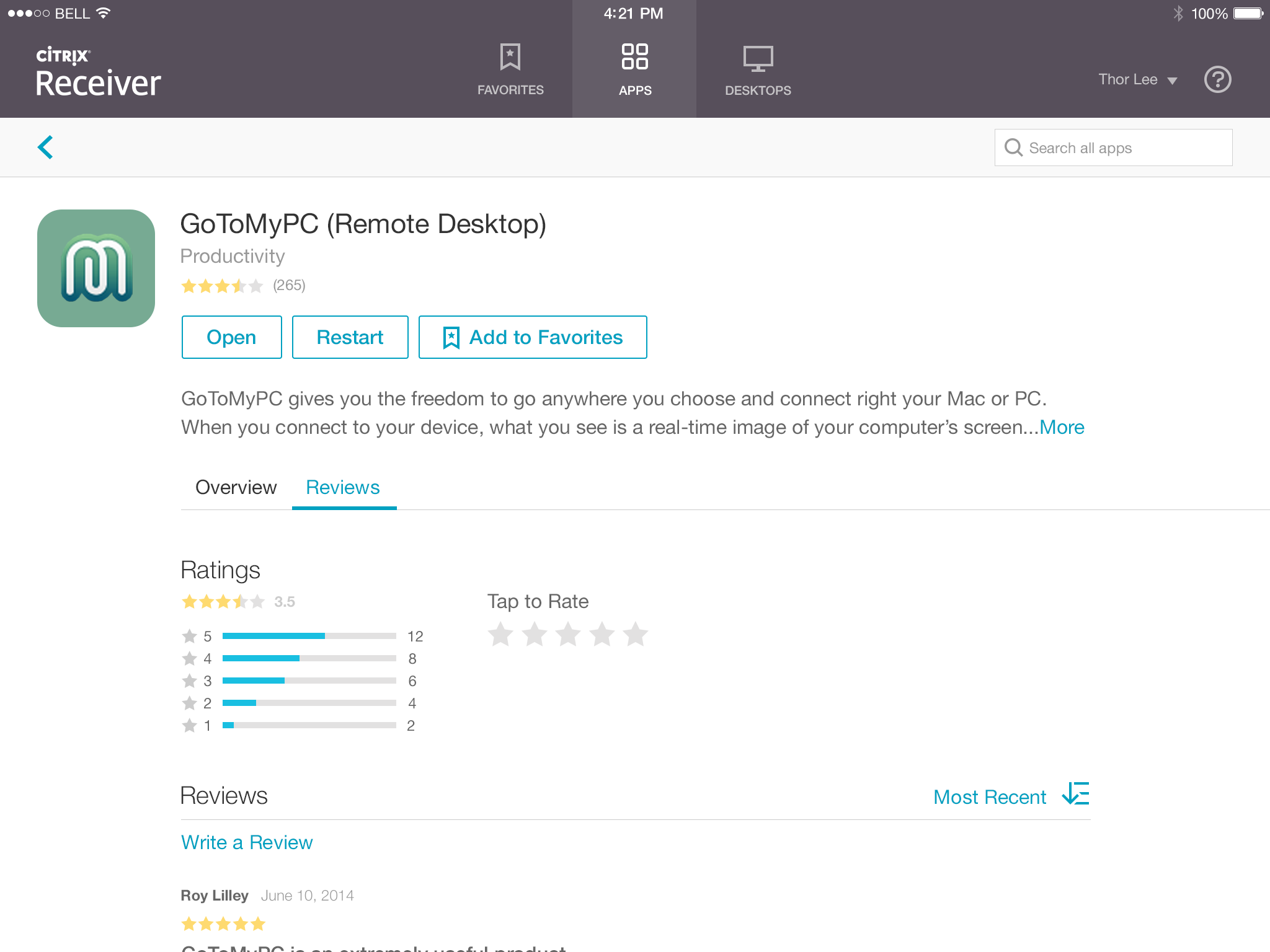
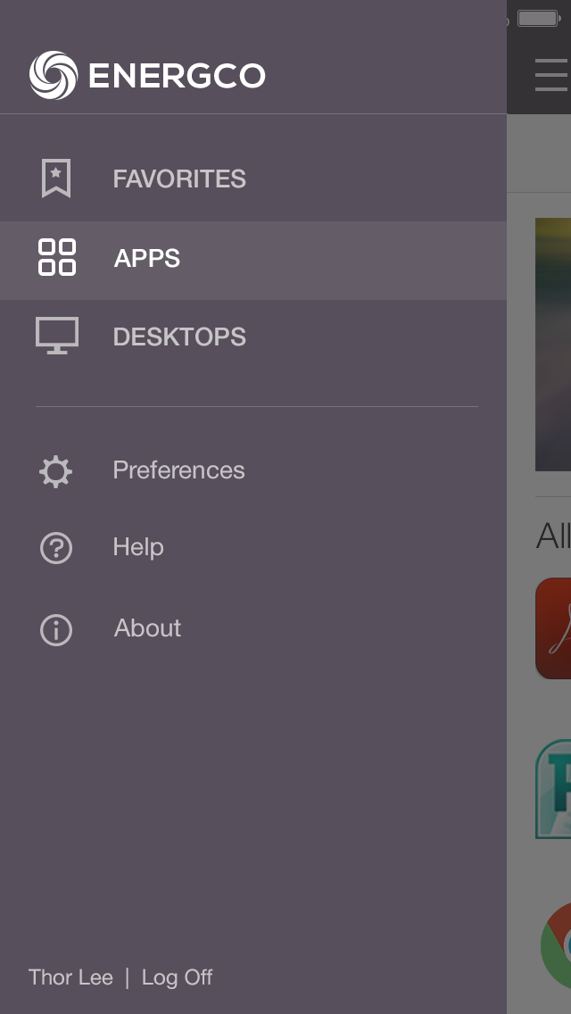
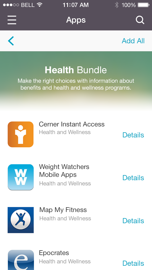
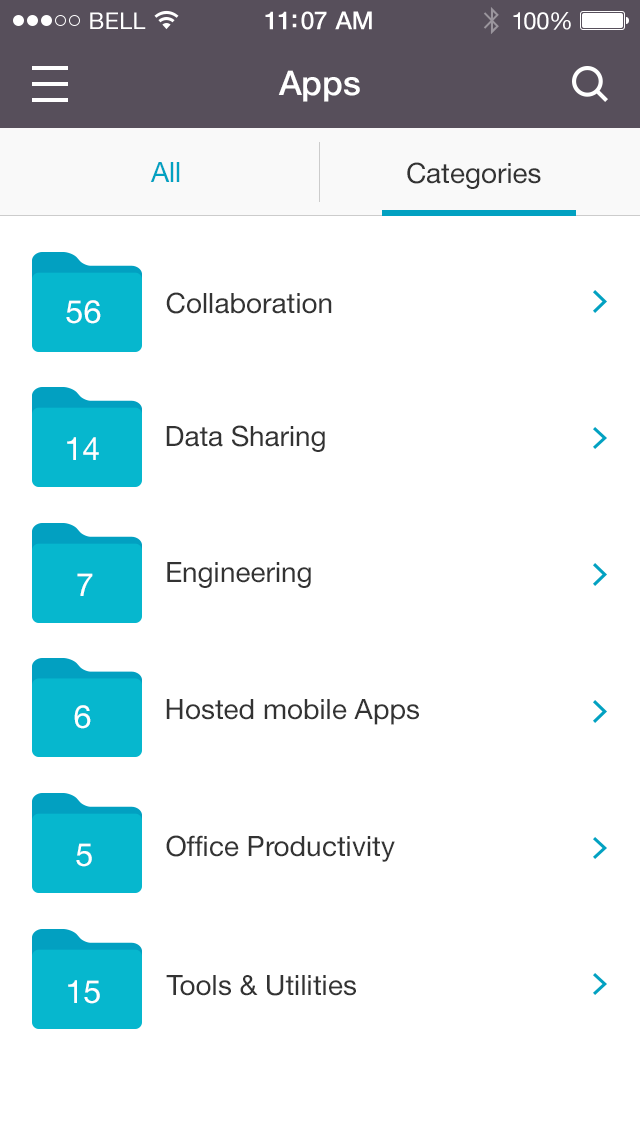
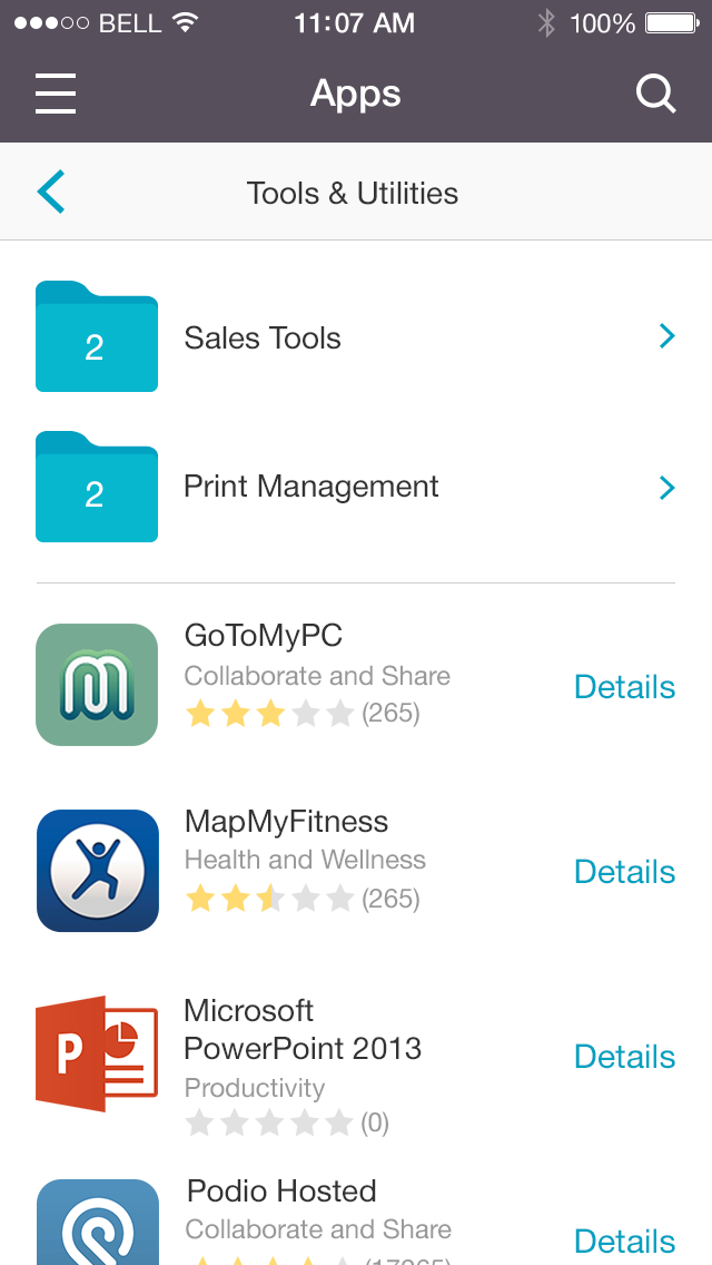
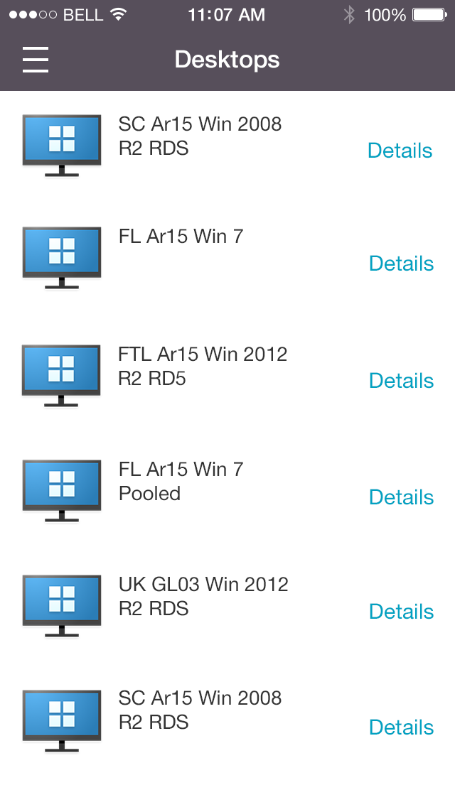
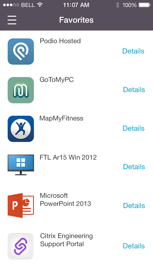
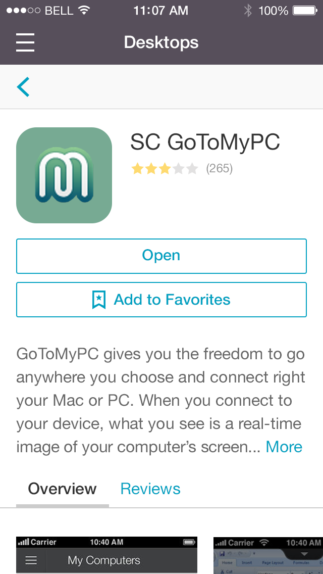
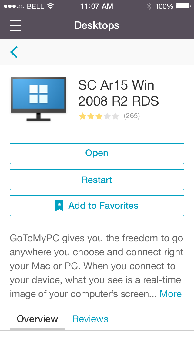
Here are the visual designs:
I. Web & tablet:
II. Phone:
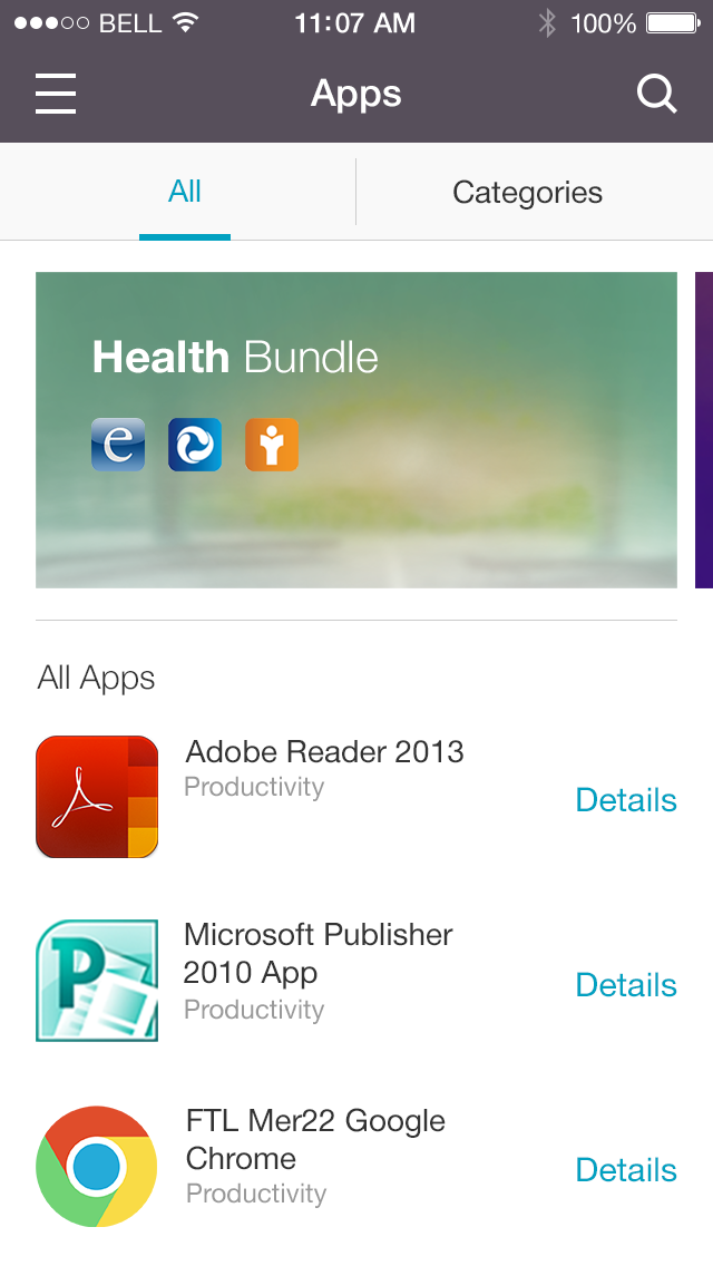
Summary
Design projects vary according to the scope, timeline, team, and, most important, business priority and impact. A design lead need to understand the circumstance, advise priority, and decide what to take and how to approach.
Collaboration is always one of the keys to success. Citrix is very engineering driven enterprise IT service provider. Relationship building and communication take time but absolutely worthy. The first empathy a user experience designer should have is to coworkers, so that teams can ally and be efficient.
Designing a client end experience that responds admins’ configurations and runs across platforms and devices is definitely complex. However, it’s also the fun part and achievement of design — see positive impacts on customer experience.
In-virtual-session Experience Design - Citrix Receiver for Chromebook and HTML5
About this post
This post is about designing user experience in virtual environment on Chromebook and browsers across multiple devices. It describes our design process, thoughts, and outcomes.
Medellin, Colombia, a city has had to deal with serious problems. Today it’s listed as one of the most innovative cities in the world.
Citrix created a node structure for Medellin that allows every one of the 407 schools to be connected via one centrally-located data center. All 400,00 students across the entire city have equal access to virtual desktop and applications.
For better education and life, this’s one of the impacts we are doing. To be more specific, I design end user experience in this virtual environment — Citrix Receiver in-session.
In-(virtual)-session
Citrix Receiver is a client software that provides access to virtual desktop and apps from any devices, including laptops/desktops, tablets, and smartphones. It contains 2 major pieces:
A client to navigate and access virtual services (You could imagine this’s a door.) and
An environment to use the virtual services — This’s the “in-session”. (You could imagine this’s inside of the house.)
Here are some screenshots about in-session:
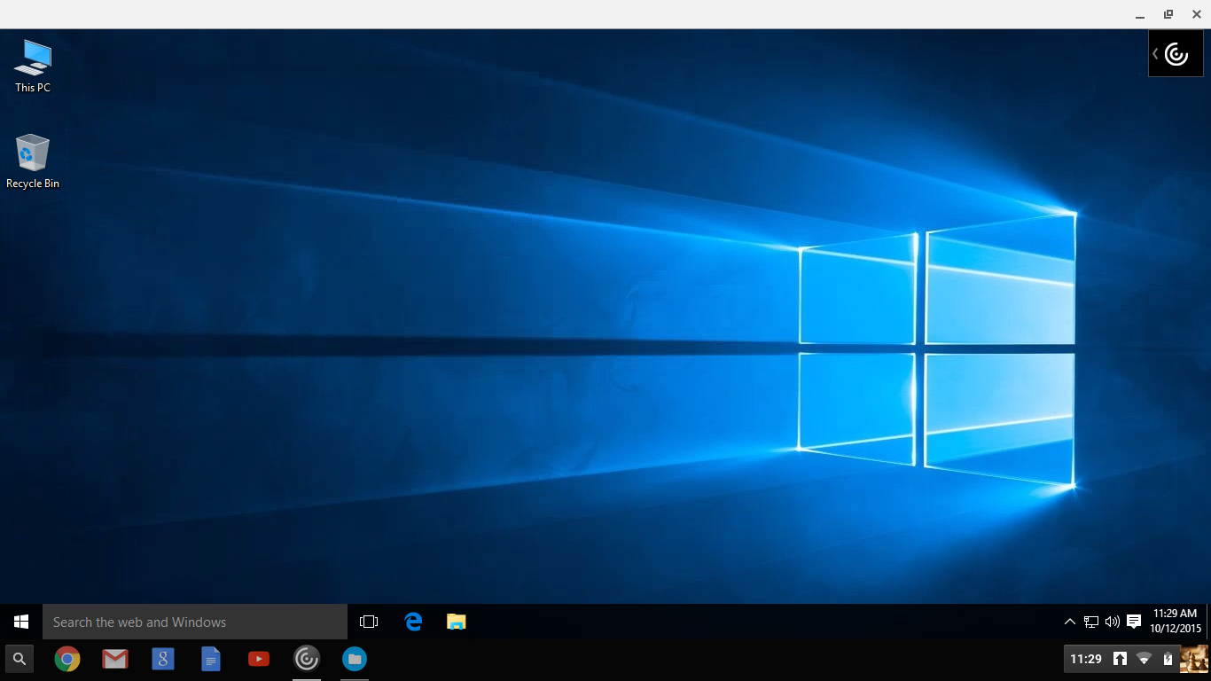
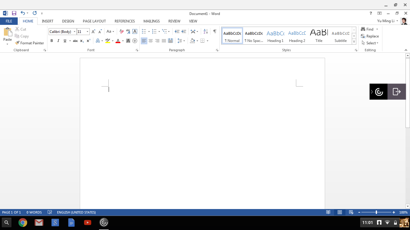

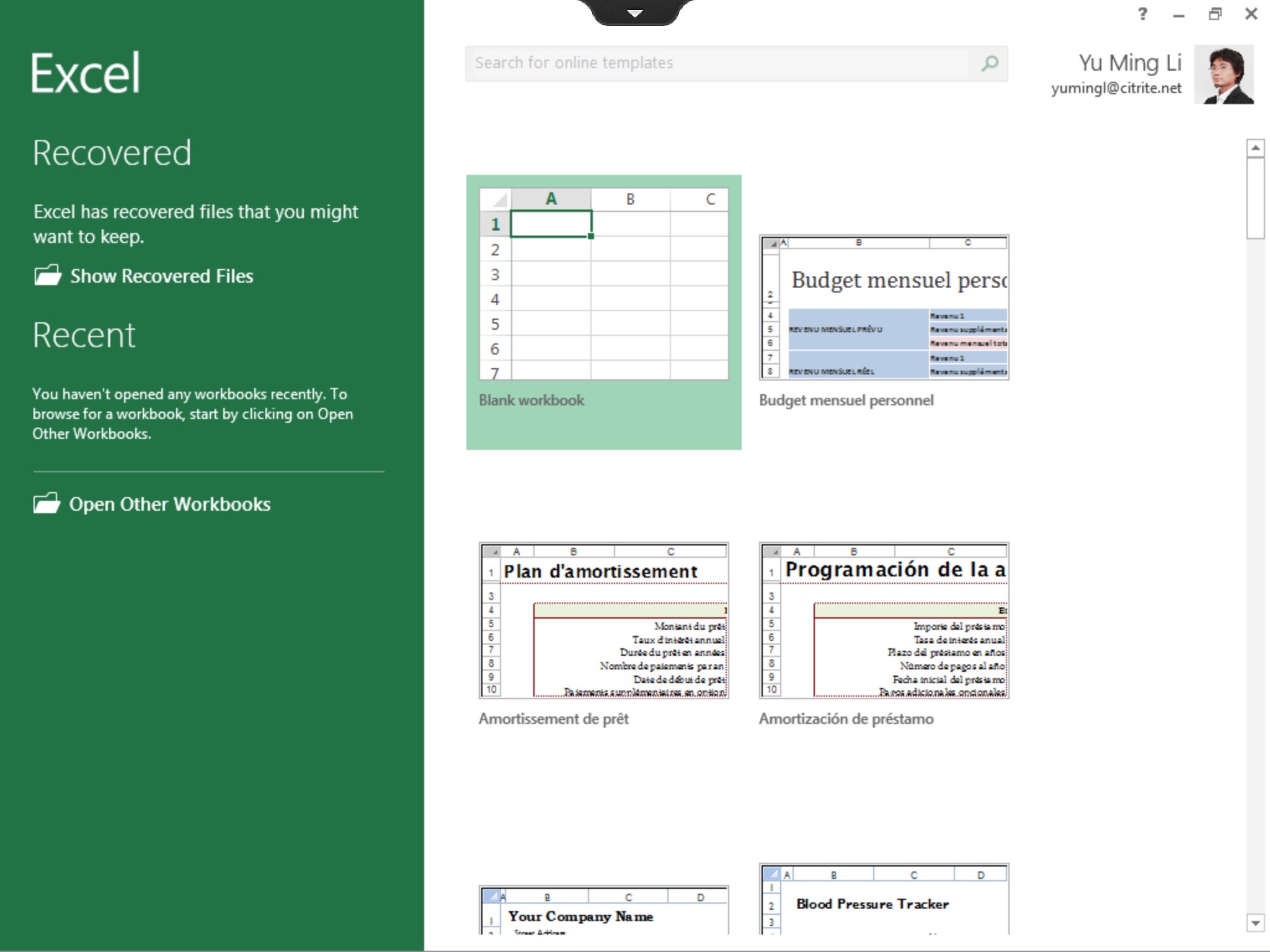
Problems to Be Solved
The concept between virtual environment and local devices isn’t clear for non-tech savvy users. Sometimes these are unrelated or even conflicting. For example:
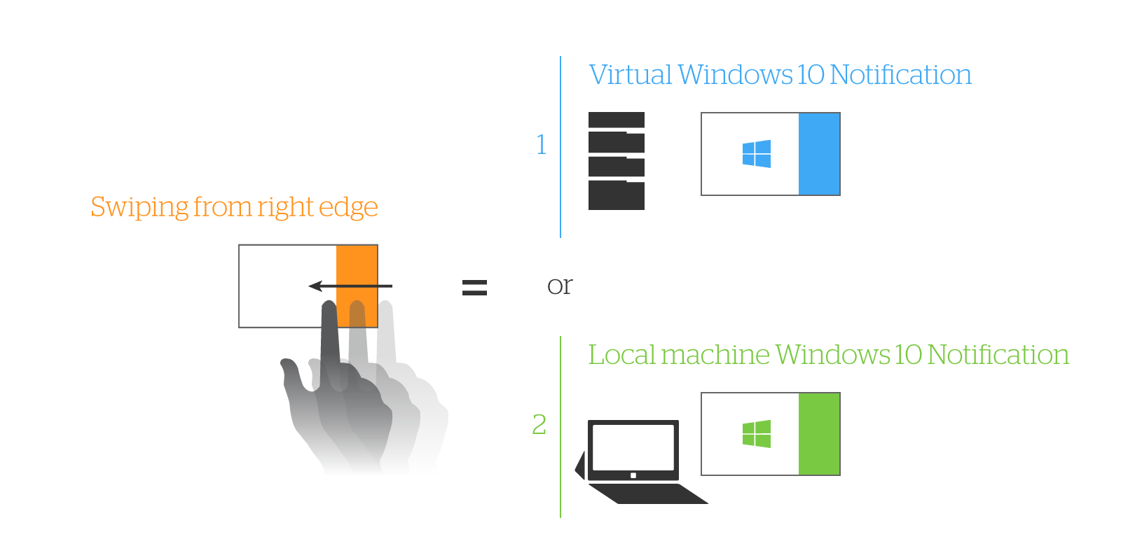
Gesture conflicting
If an user launches a virtual Windows 10 and makes it full screen in a local Windows 10 installed on Surface Pro3, when he/she swipes finger from right edge to screen center, which Notification panel should be triggered, the local one or the virtual one?
Unexpected workflow
When an user try to copy & paste a string between local and virtual apps in HTML5 based environment, he/she actually need to paste the string to a virtual buffer first and copy again from there. For security reason, HTML5 prohibits direct accessing users’ local environment.

You probably have sensed the gap in between, and this’s the problem we need to solve. The problem details were identified in design process (which is written in next paragraph). Our goal is to bridge the gap and make virtual services easy to use for various types of end users. The measure of success is either:
Users can interact with virtual services just like native local environment, or
Users can memorize the interaction we designed without repeated learnings.
I’d like to focus on Chromebook and HTML5 (browsers) in-session experience design in this post. These are HTML based environments and leverage the majority of the code base in architecture. You’ll see more platform stories in other posts.
Since this’s also the first post about in-session experience, I’d like to include some research and analysis homework we did in this one an half year.
Existing in-session controls in Chromebook and browsers look like these:
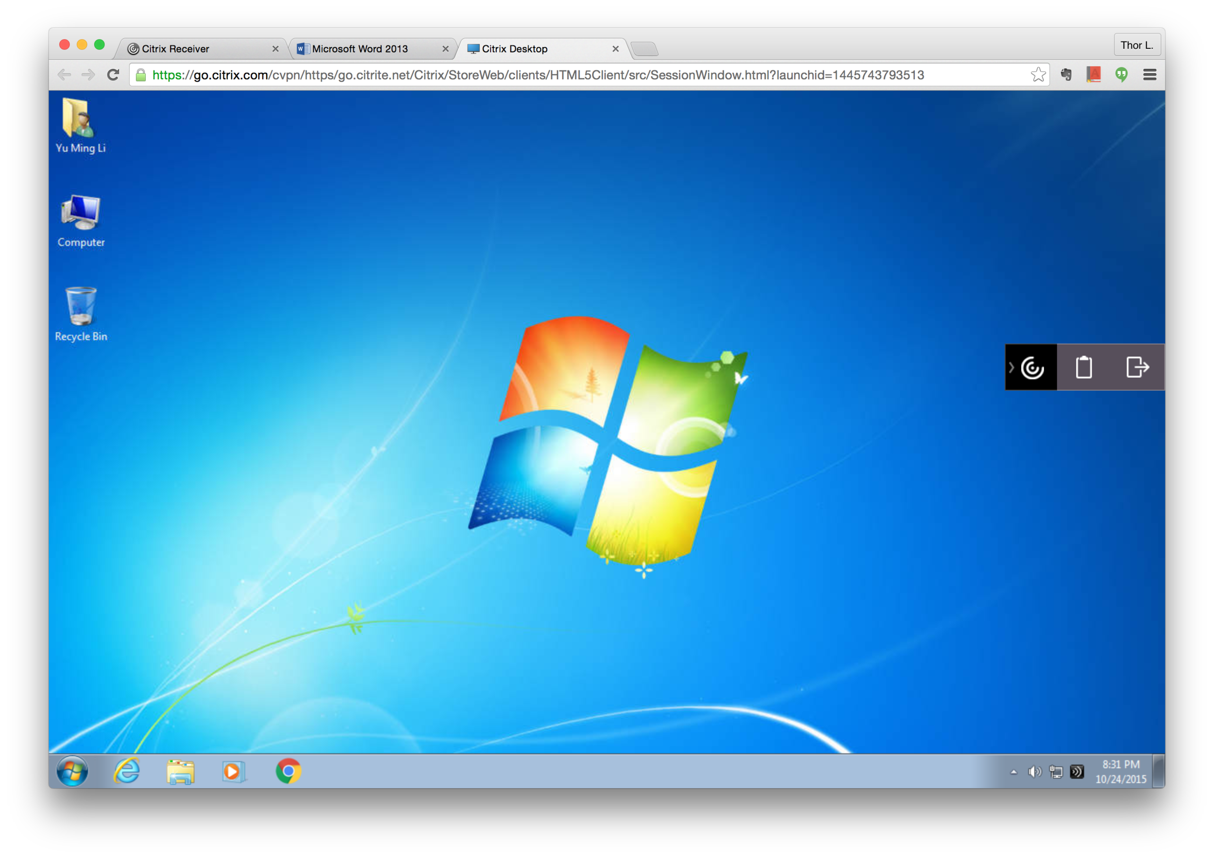
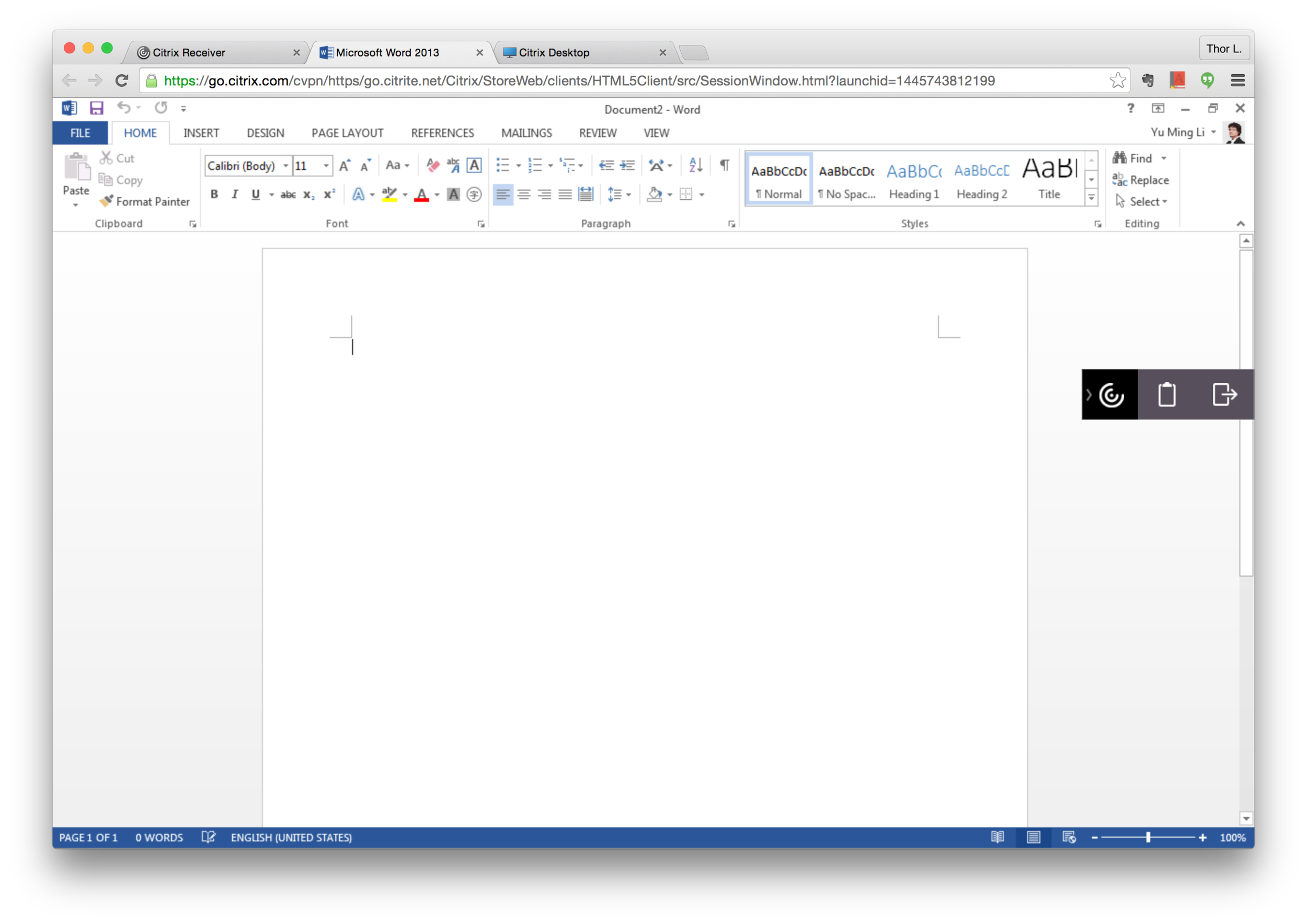
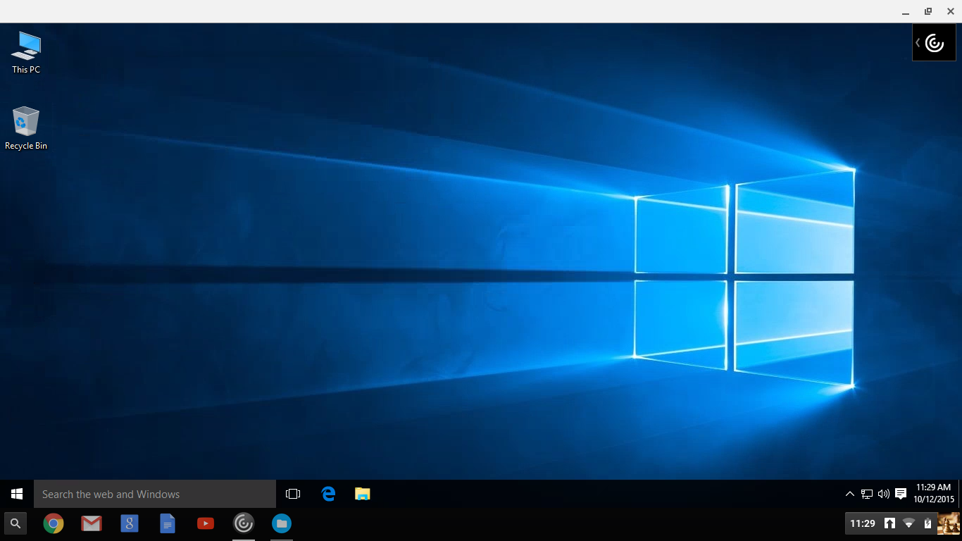
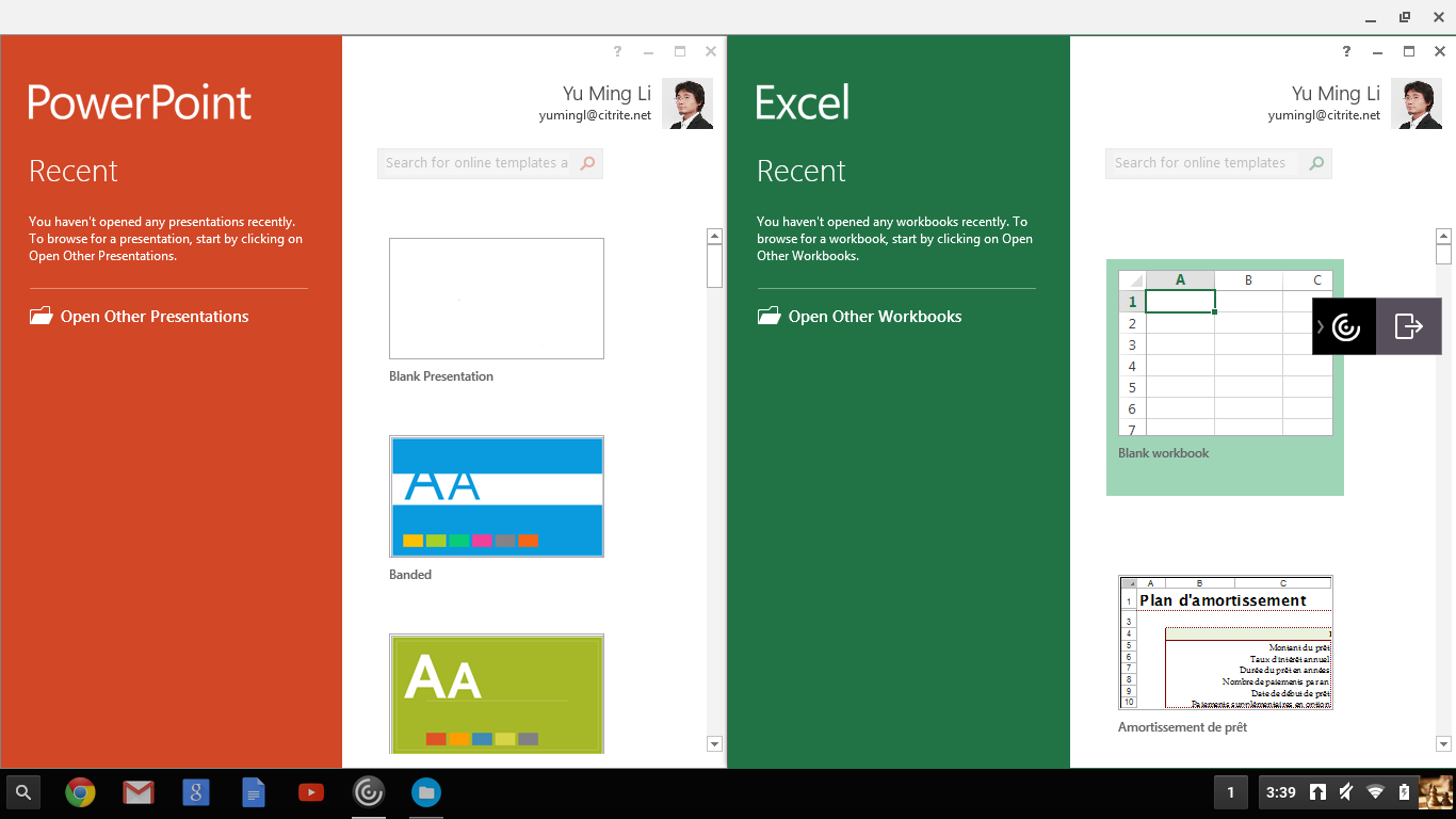
Customers have complained about in-session user experience for a while, such as:
Toolbar is too big.
Can’t separate apps into individual windows.
(More details in user research paragraph)
The scope of this project is big:
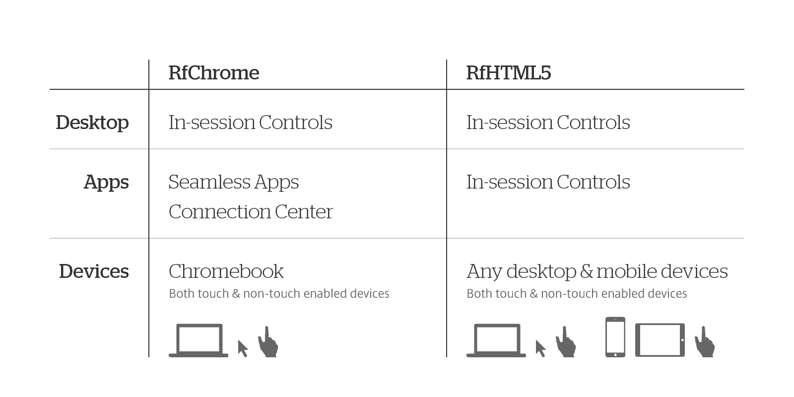
Redesign existing in-session controls for virtual desktop in Chromebook
Make virtual apps seamless as native apps in Chrome OS and design native-like controls for supplementary functions
Redesign existing in-session controls for virtual desktop and apps in browsers — mainly on Chrome, Firefox, and Safari across desktop and mobile devices
Design Process
Similar to the IDEO design process, we came out a solution after deep understanding problems and then validated it.
The major difference is that ours is not linear. Design, research, product management, engineering, and customer support teams are actually going side by side in countless small and big discussion loops.
Designing in-session experience is not a single problem. We also need to consider its:
Complexity across multiple platforms,
Scalability for context and feature changes, and
Flexibility for various industry needs and customization.
I’m relatively senior. I lead couple designers and work closely with researchers, product managers, engineers, and customer support team to tackle the problems. This’s a great opportunity to learn and practice leadership.
Designers and researchers are definitely user centered. Product managers and customer support teams own business numbers that help us understand the priority. Engineers know feasibility. With these, we make decision with impact.
#1. Discovery
User Research
In terms of empathy, the biggest challenge we have is no easy access to real end users because:
Customers, from cooperate perspective, concern about business sensitive data.
IT admins thought they could 100% represent end users.
Without massive first hand voice, we rely on:
Customer feedbacks that sale engineers and product managers bring in,
Customer data from customer support team,
Online surveys,
Internal and external user interviews,
Customer on-site visits.
This’s not ideal but practical.
In user interviews and a customer on-site visit, we observed how people used our products. In an early stage conversation with customer, we listened to IT admins about their end users’ scenarios, use cases, and issues reported to help desk.
We conducted many user researches along with different product release timeline:

I work with the lead researcher to design survey and interview flows and assets. I also observe the interviews. Then we synthesize findings together. Comparing to past, we are much clearer about what the pain points our end users have. User research no doubt is insightful on design process.
Self-experience
Another way to discover is to experience. Based on user researches, we identified common use cases. I hosted workshops and asked participants to try to accomplish certain tasks and listed out all the obstacles in the workflows.
Putting ourselves in users’ shoes is always a good method for empathy. The participants came from different backgrounds relate more considerations than we thought.

#2. Interpretation
Re-frame the problem
Interpreting user research and self-experience results into causes help us identify the real problems. Some examples in HTML5 environment:
The existing Toolbar is actually not too big — The problem is that the Chromebook screen resolution is too small and horizontal prominent Toolbar blocks users’ vision on desktop and apps.
Accommodating apps in a single window doesn’t perform well on multi-windows tasking — Users often need to switch apps between local and virtual environments.
Users fail on copy&paste tasks — Because users expect native behavior works.
Users have hard time to find an action — Because our controls are neither visible nor recognizable.
Users can’t find a local folder — Because users aren’t clear about virtualization concept and how drives map.
Users are confused about action buttons — Because our messages or button labels contain terminologies that users can’t understand.
Users can’t get printing job done or connect a USB device — Because users thoughts external devices could work directly after plugging.
On TargetProcess (a task management tool), product managers add features as stories. Many stories might actually be one experience.
There are three stages on design evolution:
UI design,
Product design, and
Customer experience design — We are here! Coherent and holistic considerations are required.

Analysis/Study
Diving into in-session more than one year, we studied and documented platform behaviors, competitors, and our existing implementation. Here are some examples:
1. Platforms behavior analysis:
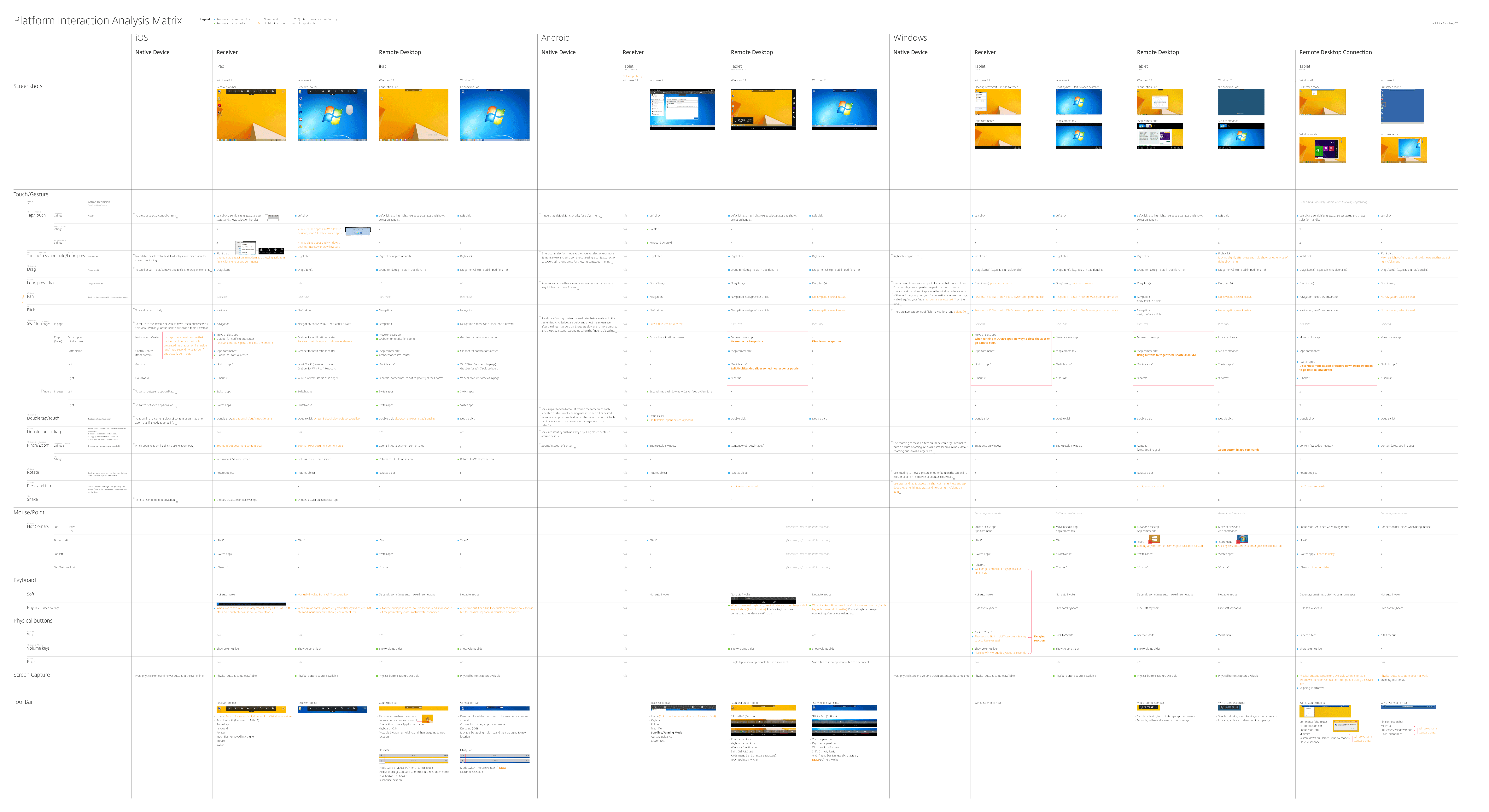
(Click to view larger size)
2. Citrix vs. VMWare vs. Microsoft virtualization client competitive analysis:
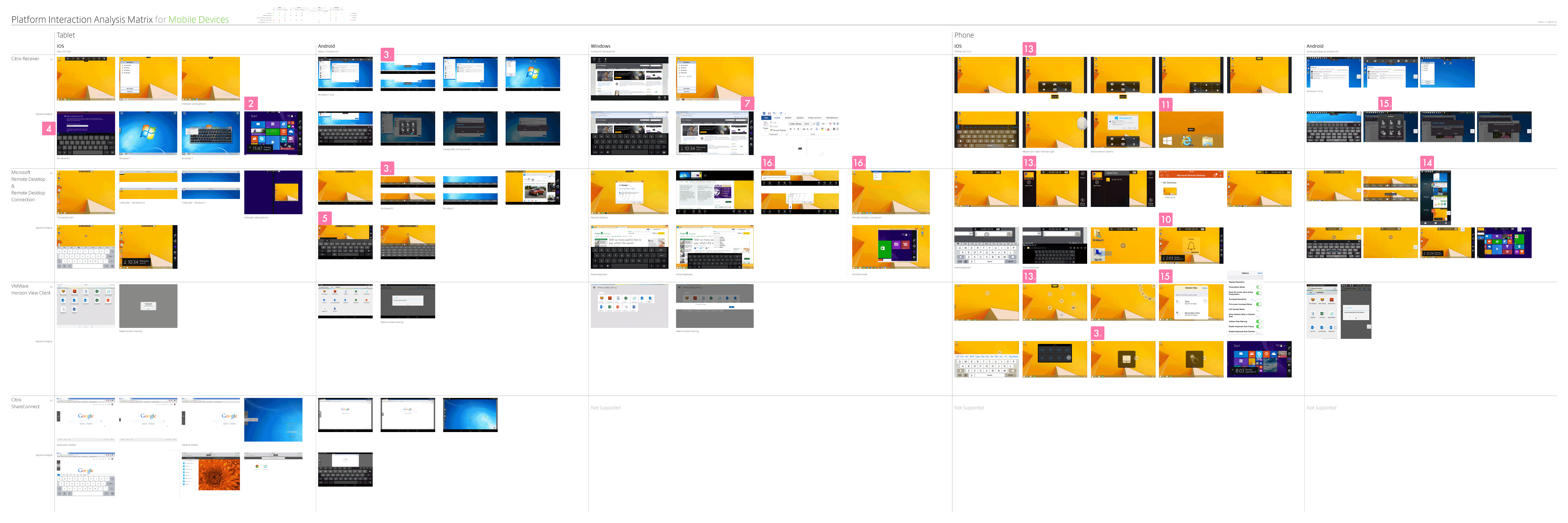
(Click to view large size)
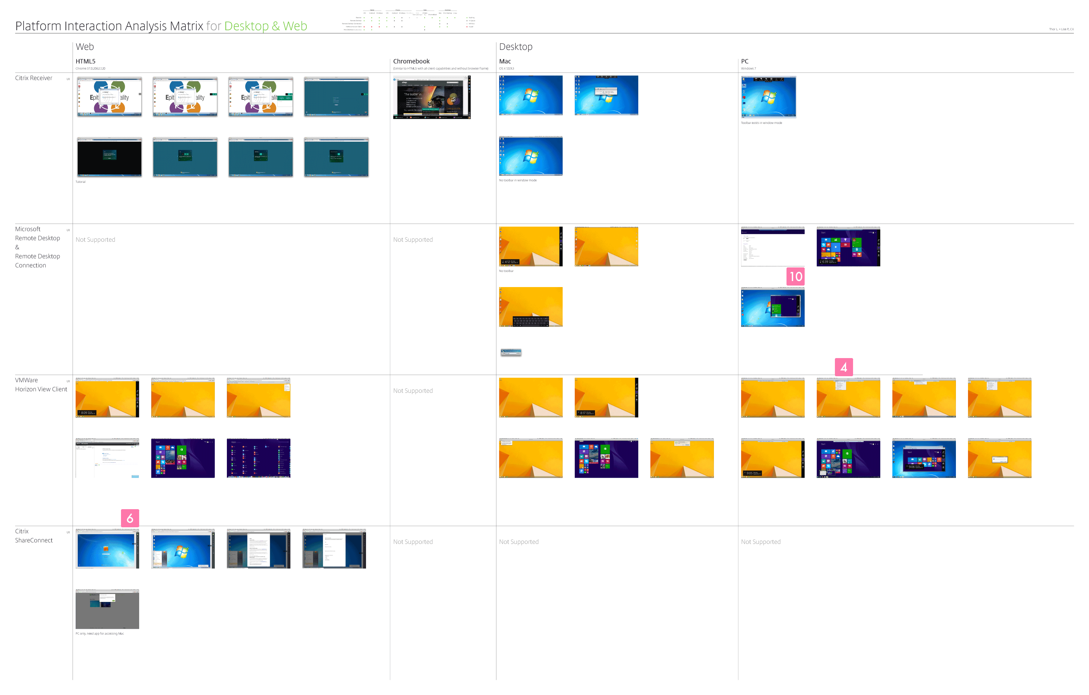
(Click to view large size)
3. High level user’s workflow:
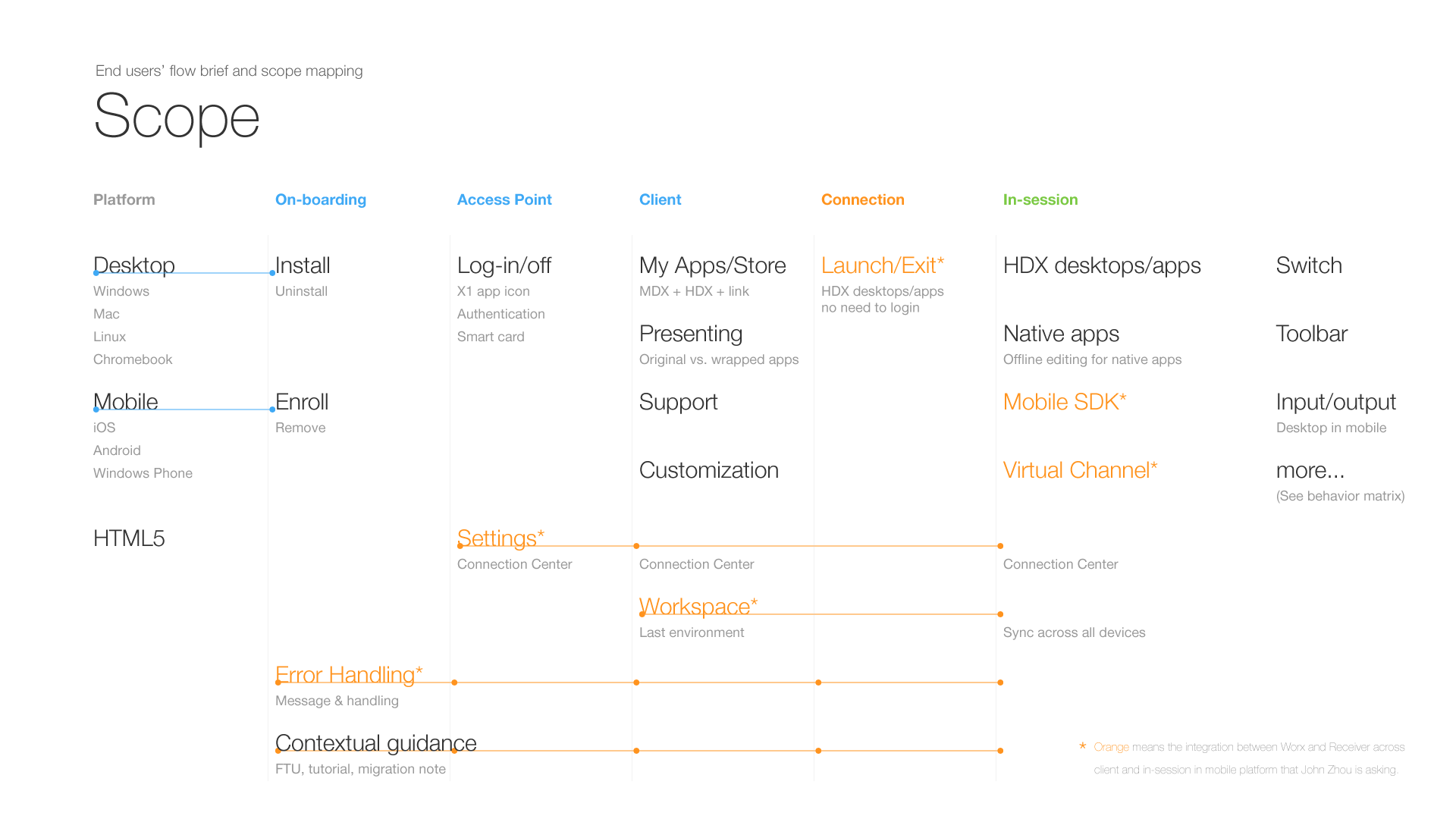
(Click to view large size)
4. In-session interactions overview and priority matrix:
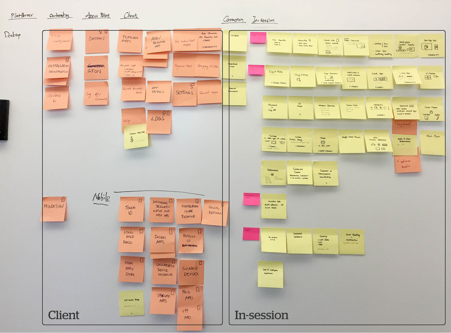
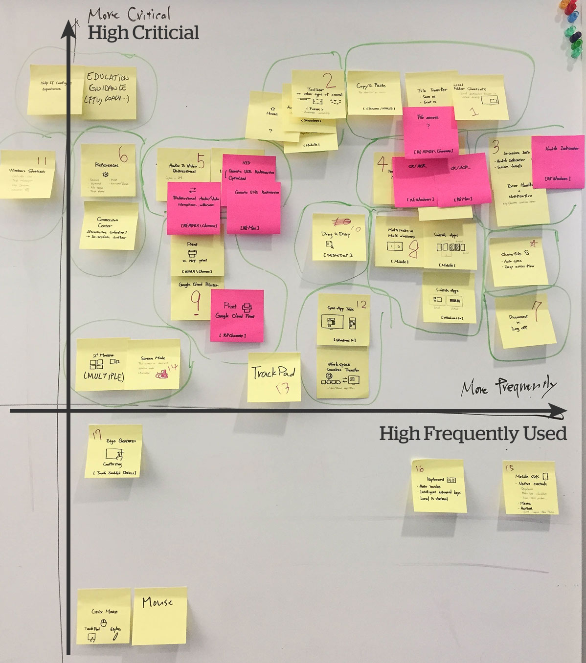
Through above analyses, we also accumulate domain knowledge. In-session is across platforms and devices experience. We need these as foundation.
5. Competitors and other references


6. Interaction Map
The most important one is the following interaction map that we defined high level information architecture. A series visualizations below illustrate the interactions in local and virtual environments:
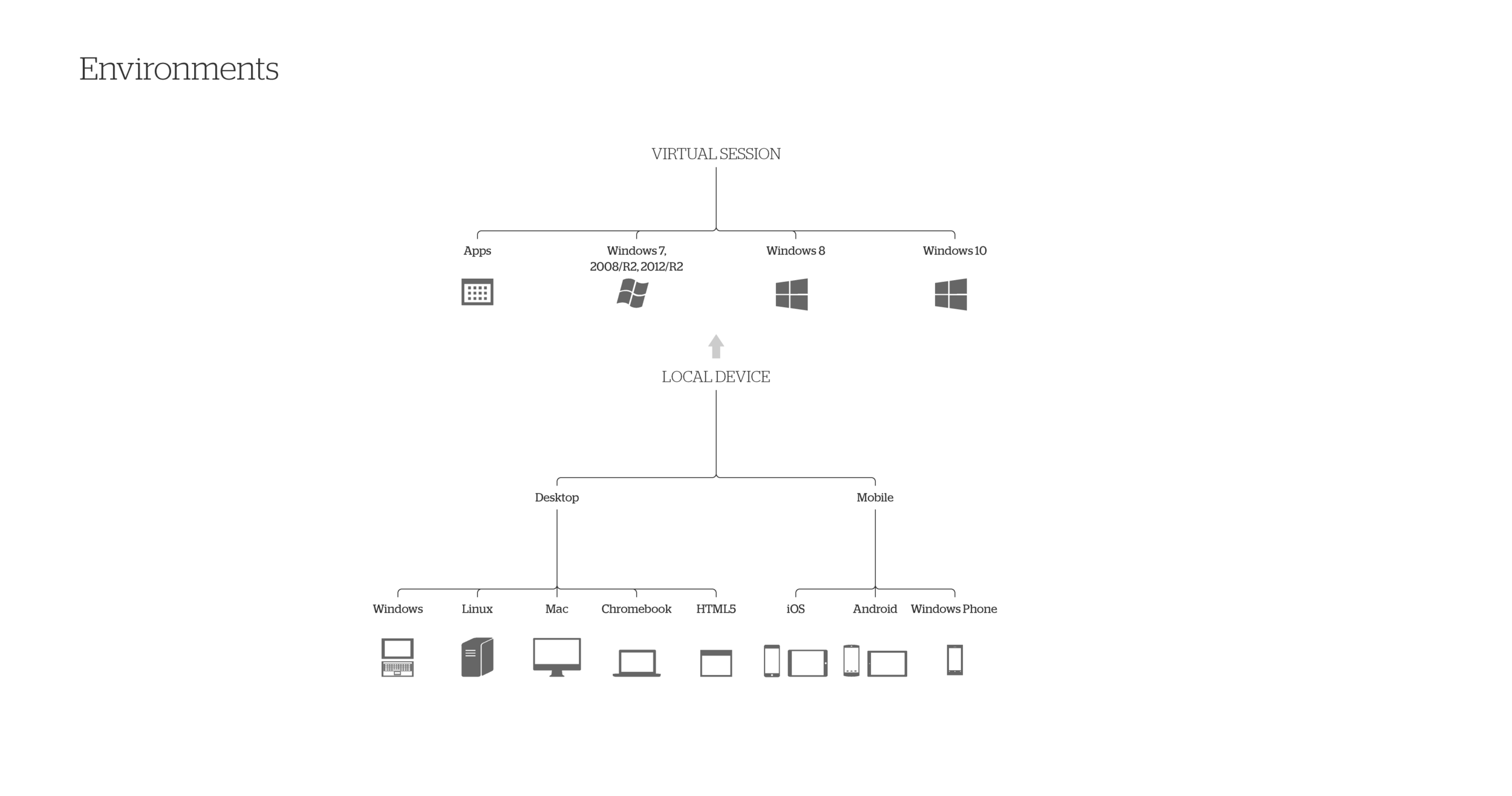
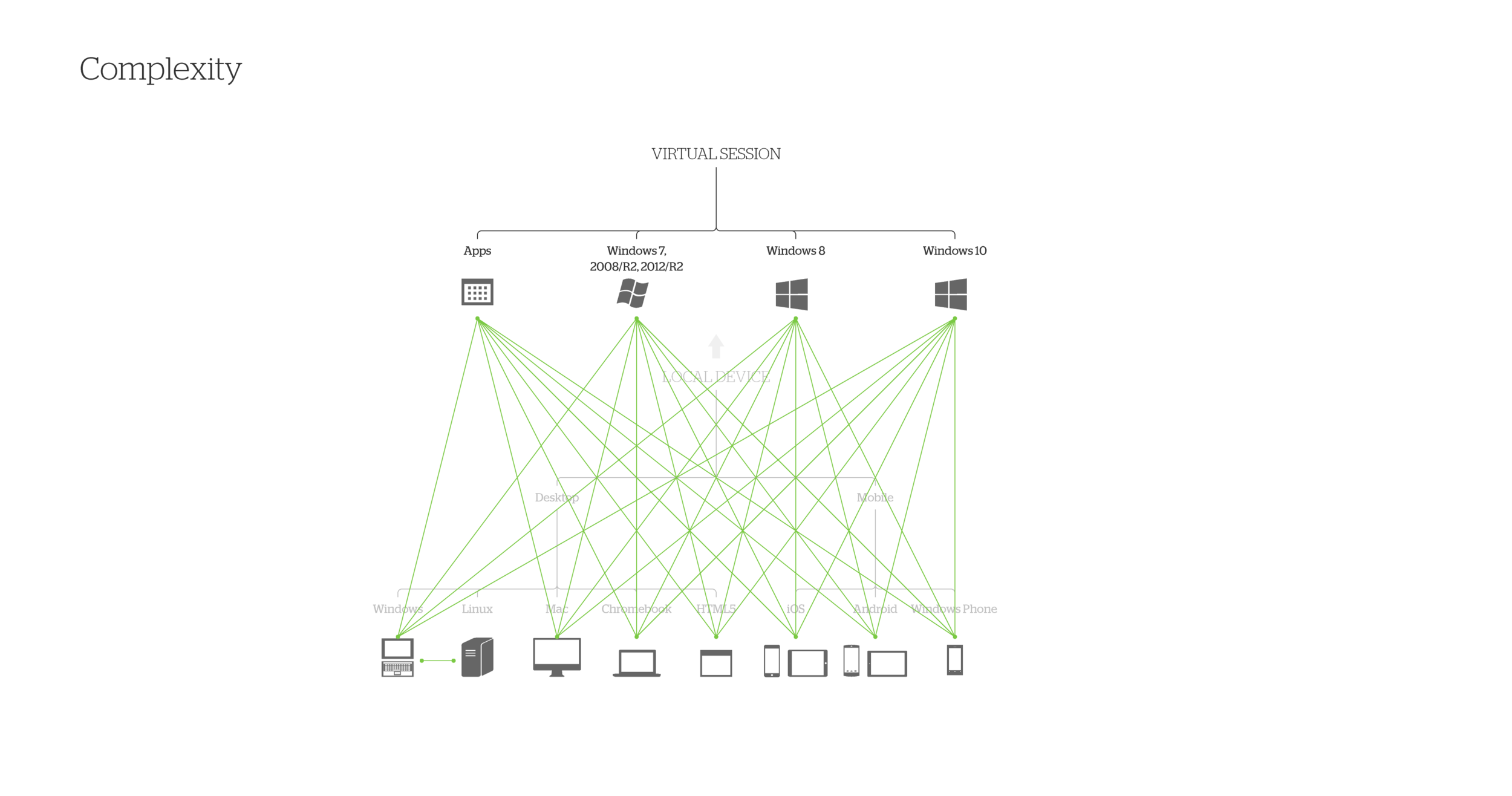
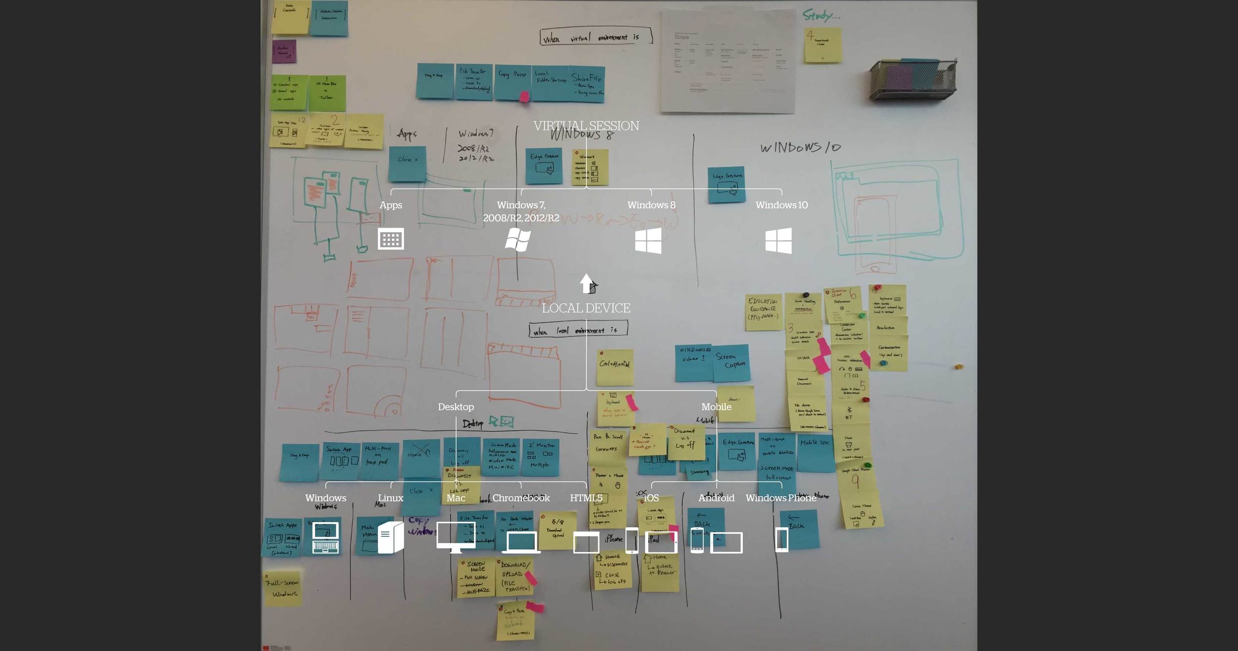
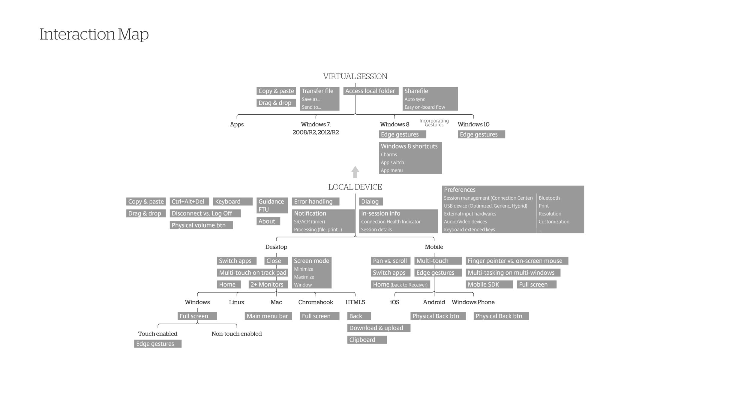
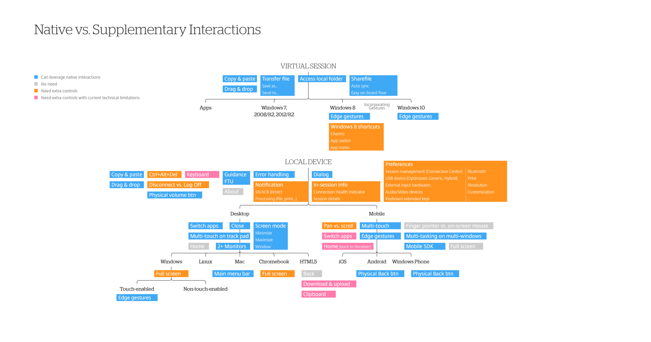
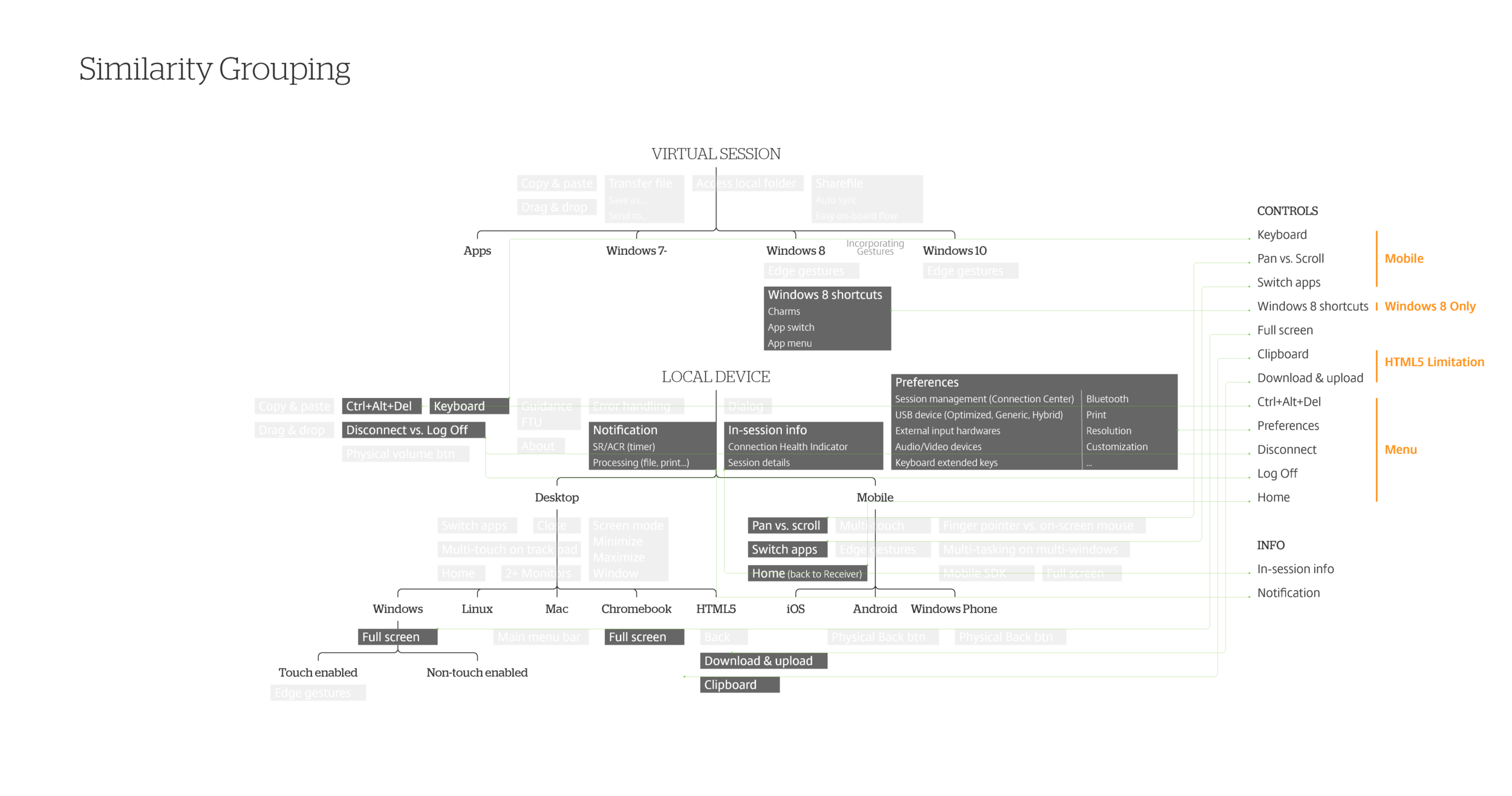
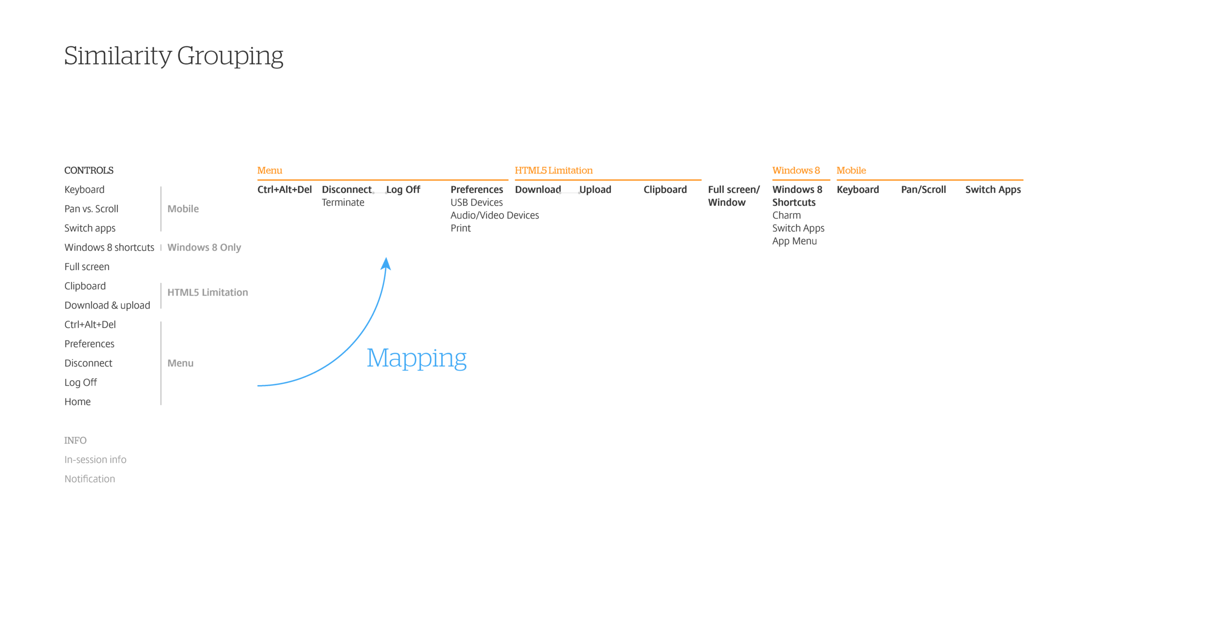
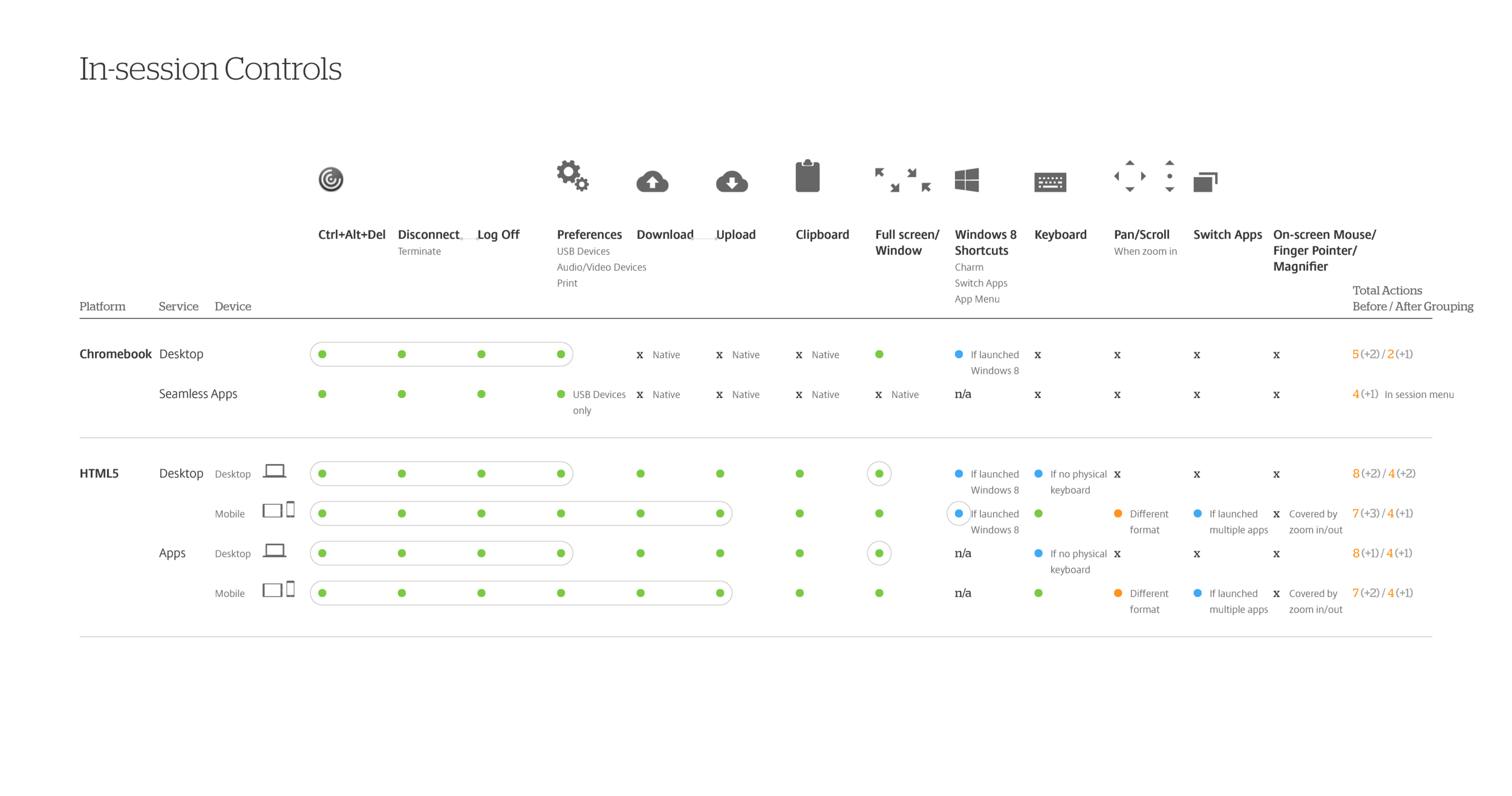
Here are the key diagrams (click to enlarge):
To be more specific for this project, we mapped Chromebook and browsers into the chart to clarify what exact functions we need. Furthermore, we differentiated these by usage frequency. Infrequently used functions were grouped for better organization. In the first right column, we are clear about the amount of functions need to be presented.
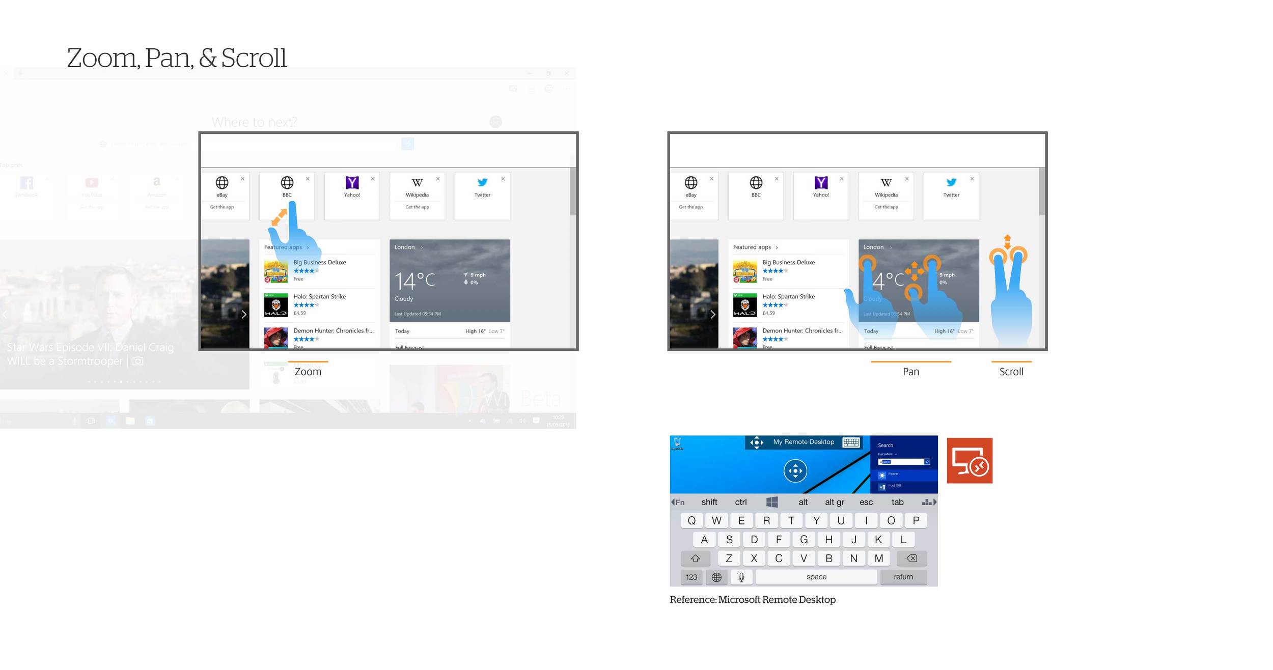
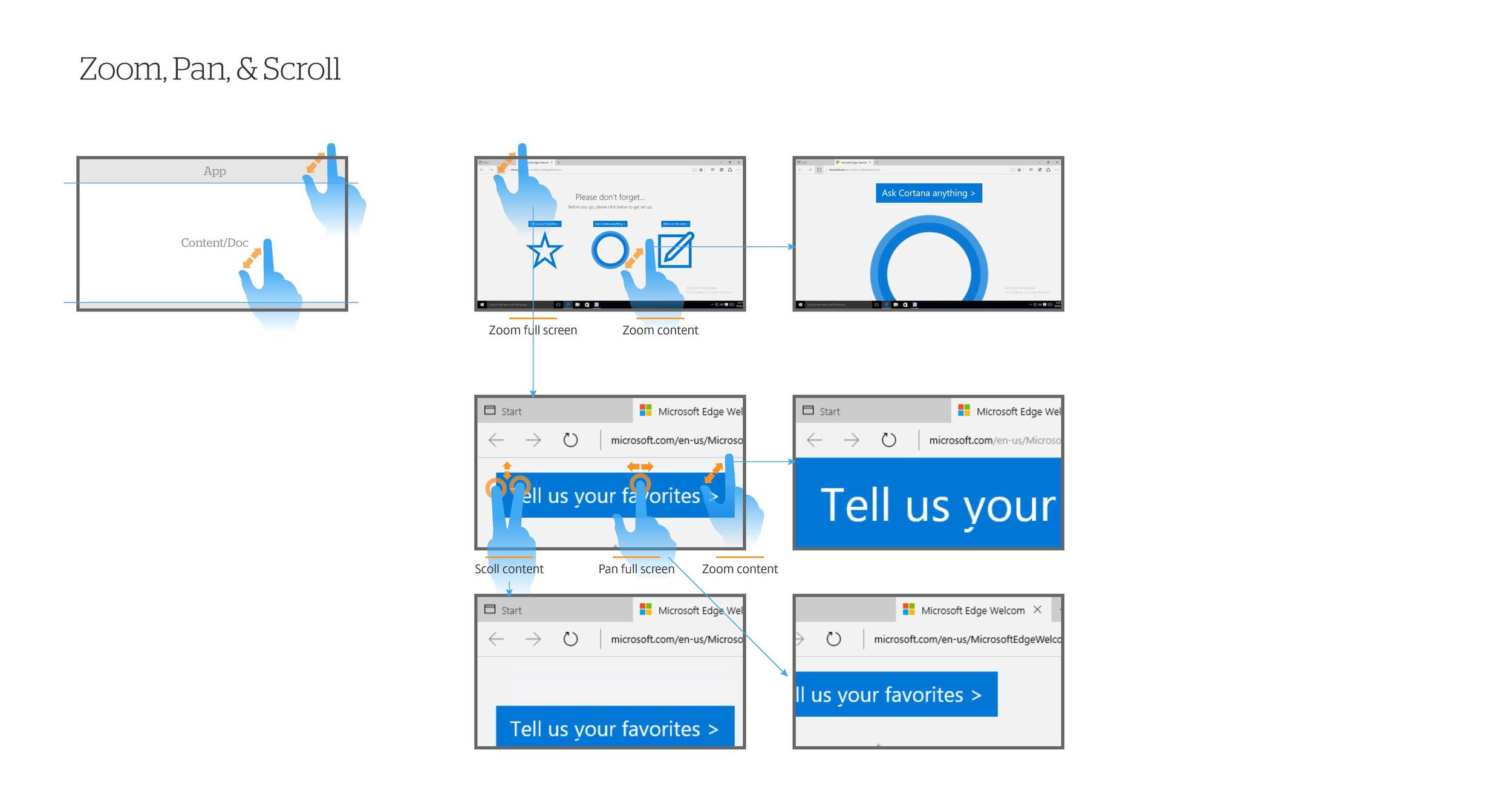
Designing for browses means multiple platforms and devices need to be taken into account: Windows, Mac, iOS, and Android on laptop, “laplet” (e.g. Microsoft Surface), and mobile devices. A quick finding is we should align with native gestures, instead of designing our own and then conflicting.
Look current platforms:
iOS takes top and bottom edge gestures for notification and common controls.
Android devices and Windows Phone take top. Both have a standard set of buttons at the bottom.
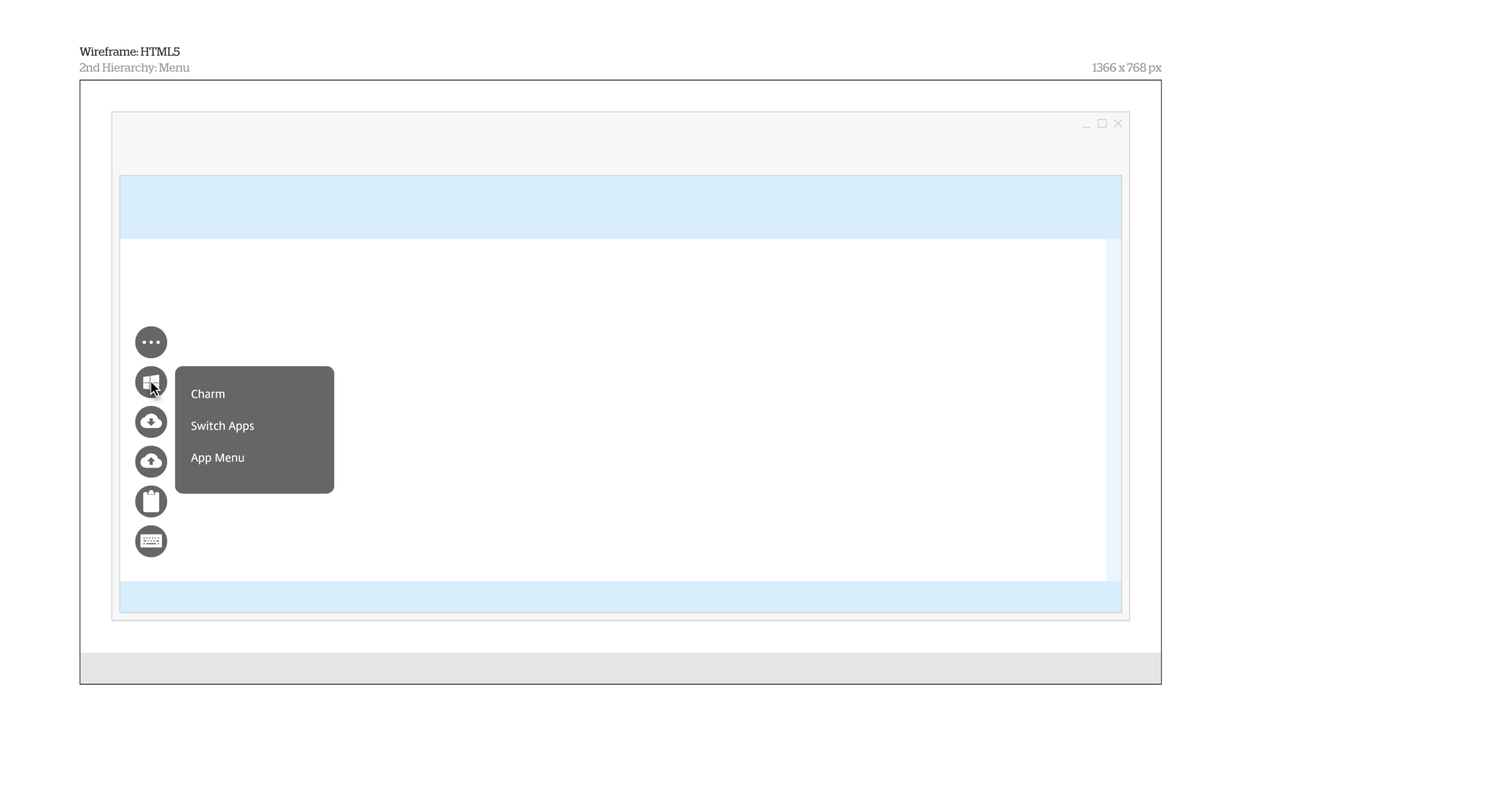
Windows 8+ and 10 take all edges: right for Charm (Win8) or Notification (Win10), left for switching apps, top for closing app, and bottom for app menu.
Browsers also take left and right for history pages navigation.
After above Discovery and Interpretation, we can define design principles:
Leverage native behaviors as much as possible — Because it’s natural.
Use simple interaction that works across platforms and devices.
Organize functions by usage frequency — Make frequently used functions visible and group infrequently used ones.
Don’t block users’ vision.
Make guidance and message clear.
#3. Ideation
Ideation usually is the most existing part! In the workshops I hosted, after everyone experiencing users’ pain points, creativity never stop bursting in brainstorm. We have explored different form factors in several rounds. Lot of ideas on whiteboardings and sketches created by team:
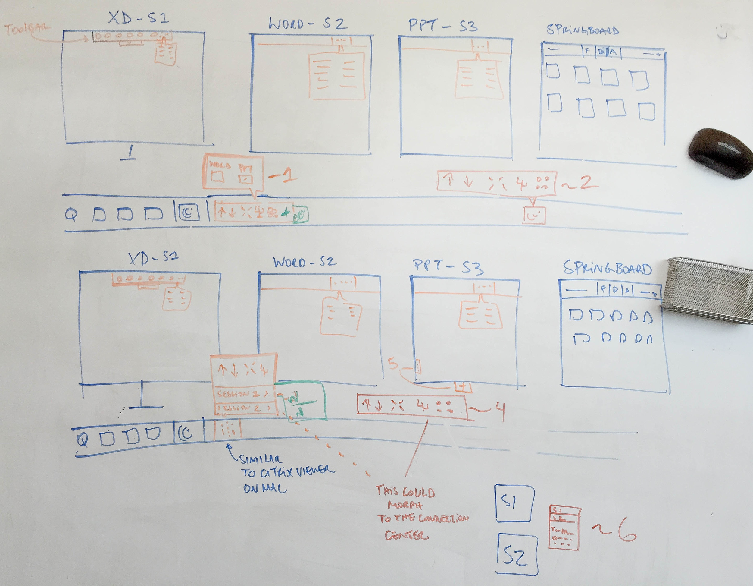
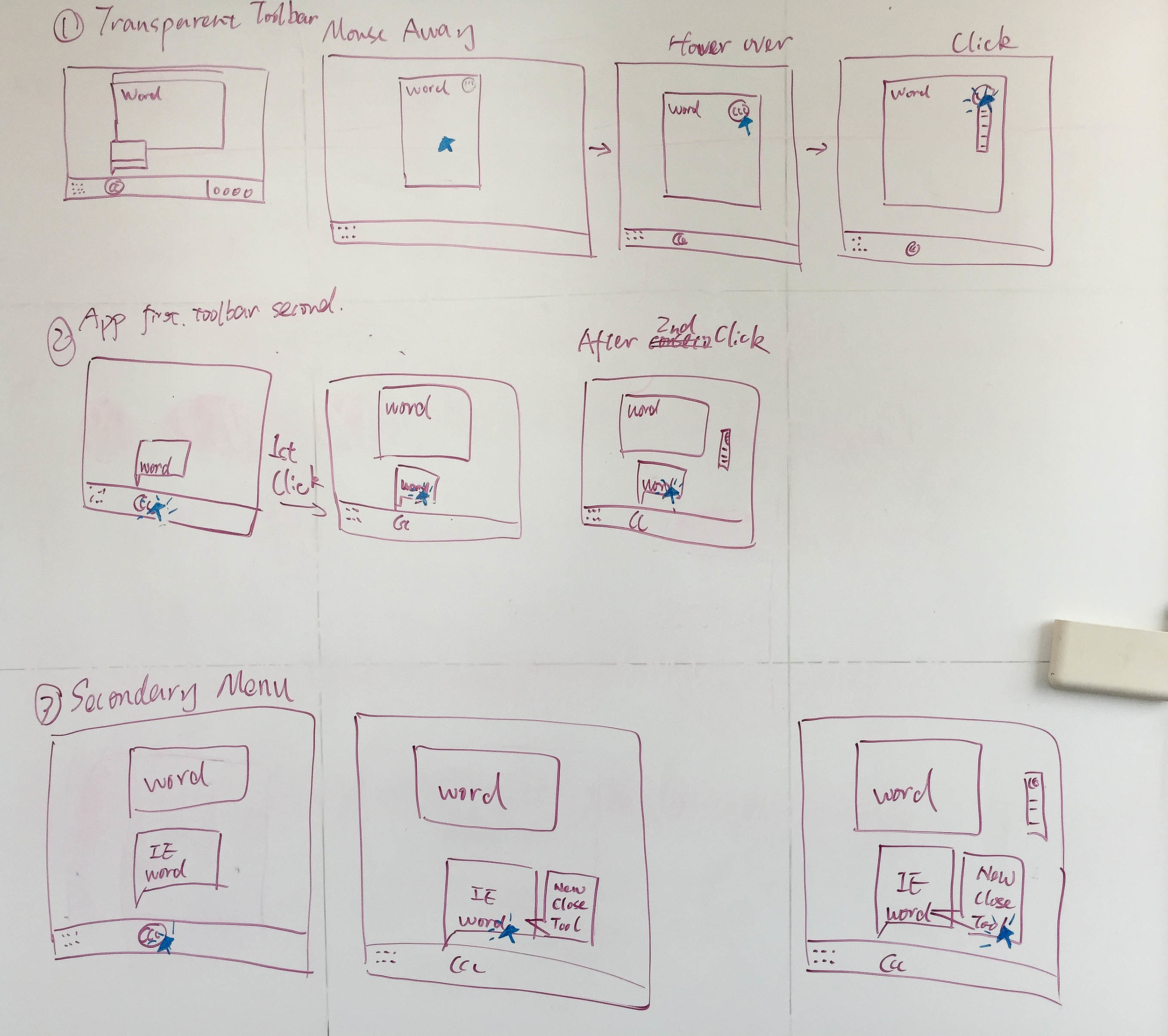
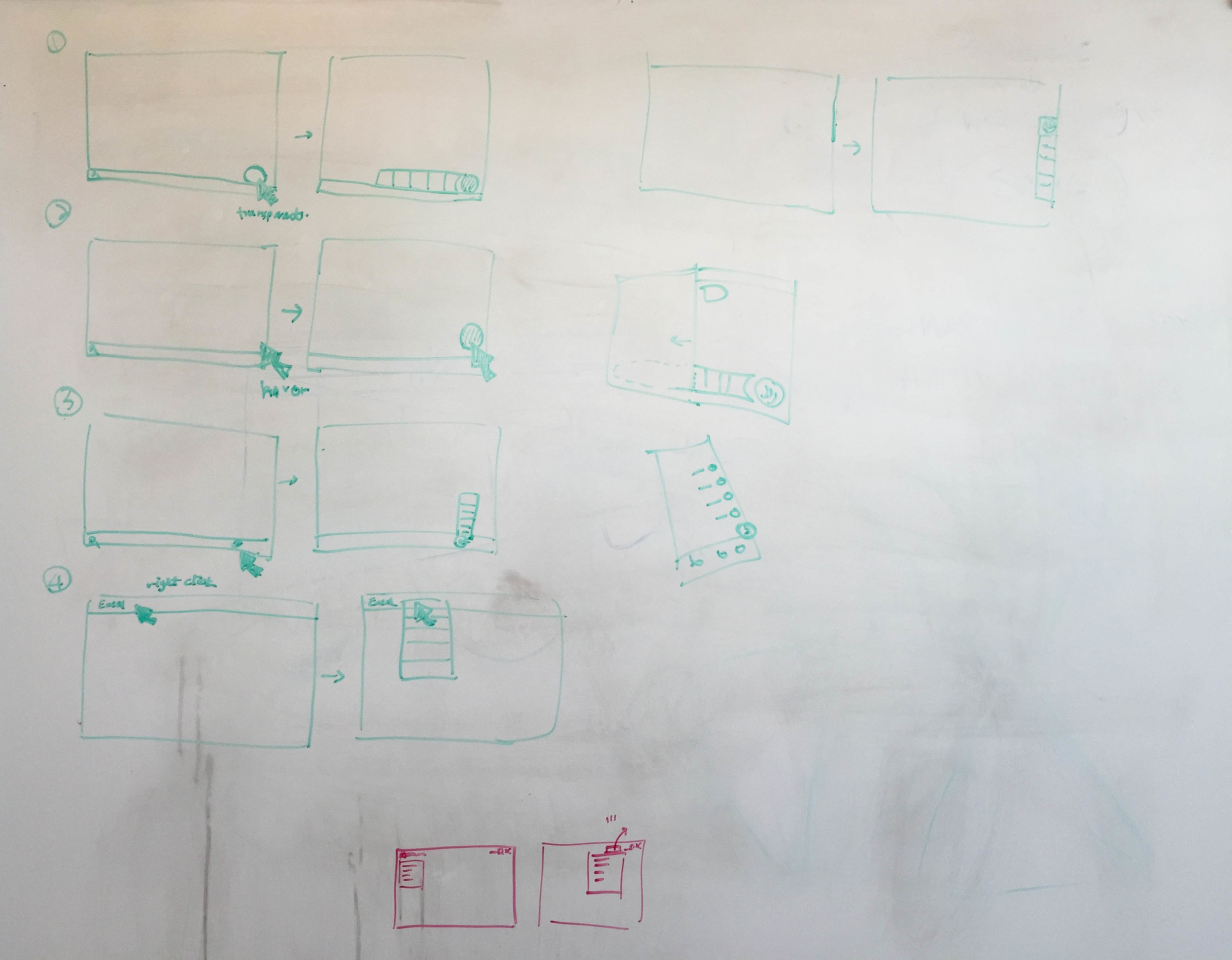
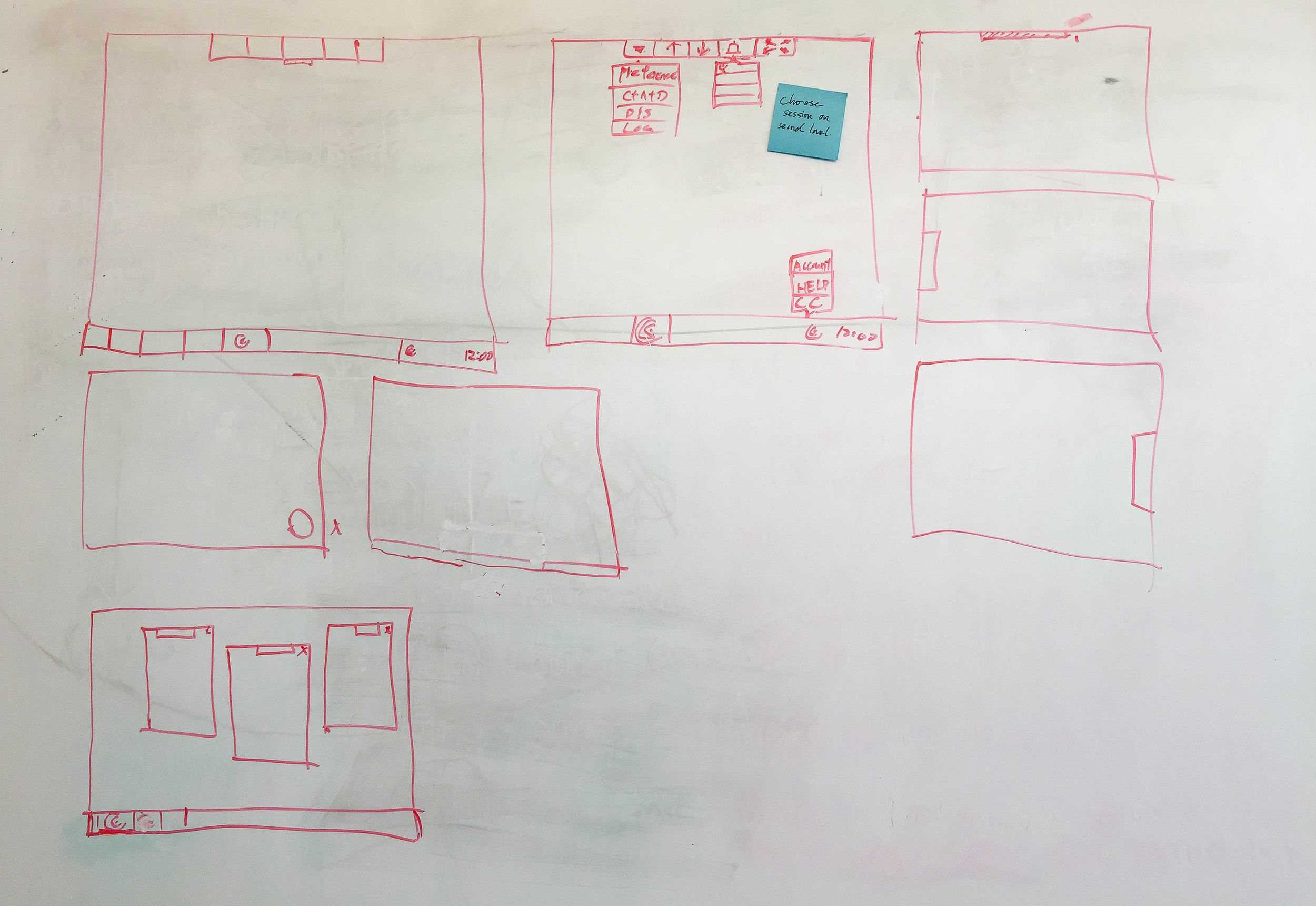
Brainstorming is fun, but post-brainstorm synthesizing is the key to consolidate all great thoughts. I usually summarize all the ideas by combining common areas and highlighting the outstanding points. This method helps me converge the main streams with branches as options.

In this moment, with product release timeline and resource etc. realistic consideration in mind, I shared concepts with product managers and engineers to clarify feasibility and direction before moving prototyping — with a premise that we have good relationship and trust each other.
As I mentioned earlier, the design process is not linear. In this project, we met a key customer to validate these ideas. Based on their feedbacks, we iterated with more and more details until the proposal is solid. Next, you will see 2 major designs in this project: in-session controls and connection center.
In-session controls

The scope of in-session controls covers virtual desktop on Chromebook and virtual desktop and apps on browsers.
Here is an exploration summary that lists ideas, information presentation, and concerns.
We picked most potential one, #4, and went deeper. I was once debating on either designing an unified UI patterns across desktop and mobile use cases or designing separately.

Fortunately, a flexible idea came up:
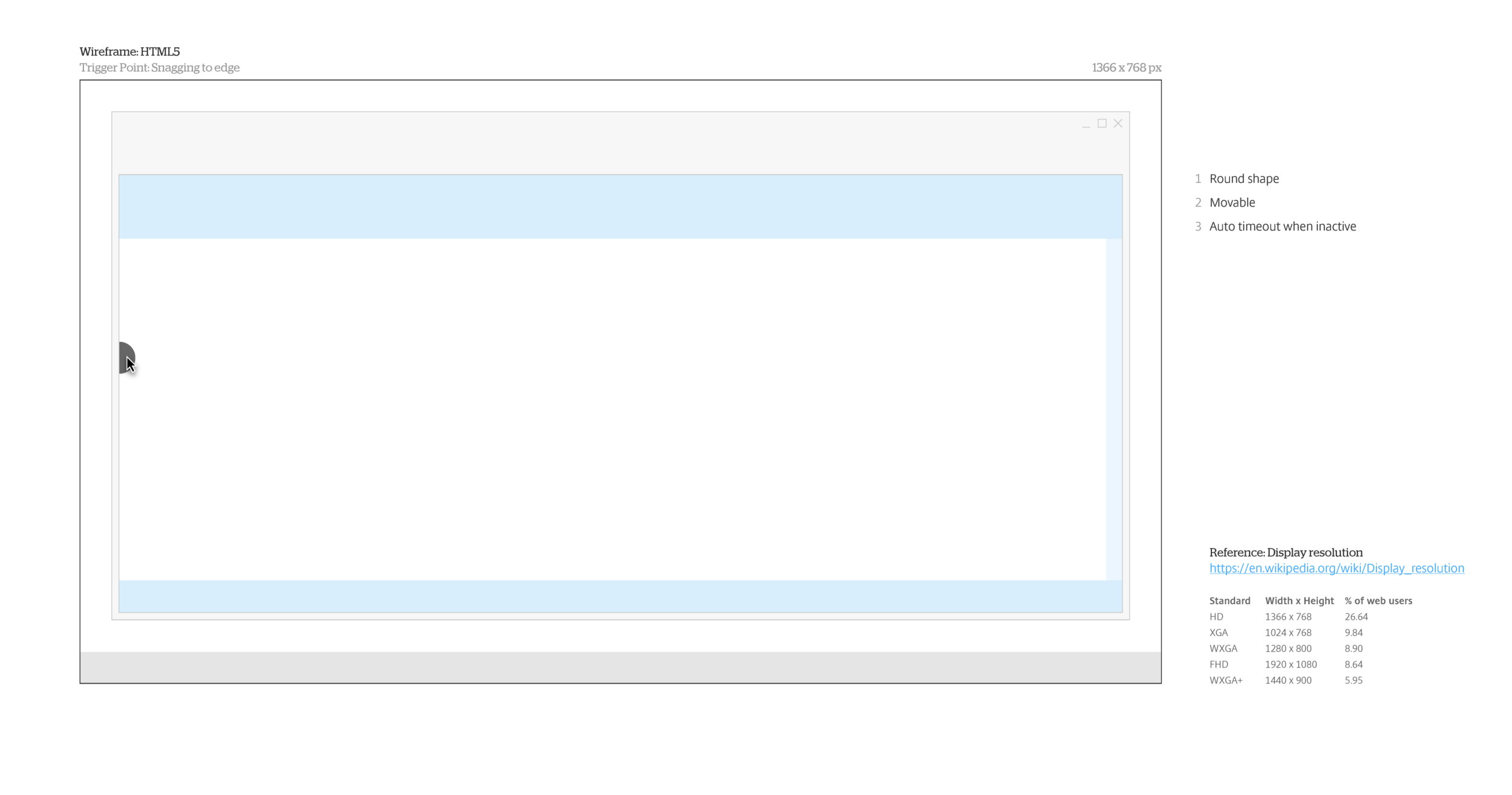
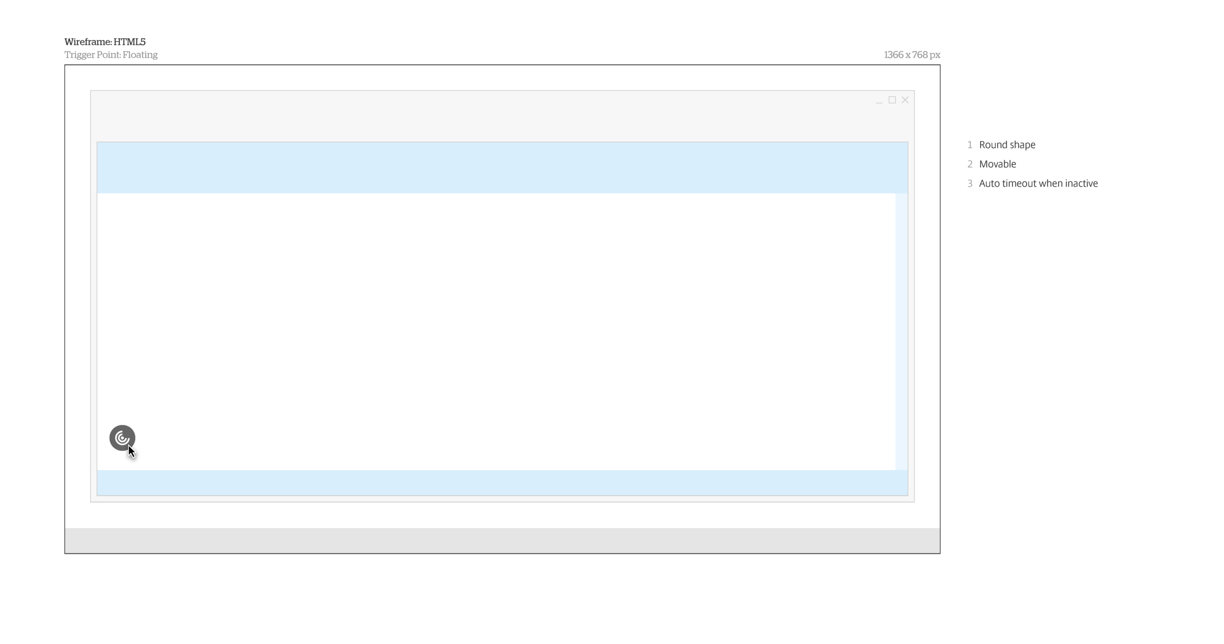
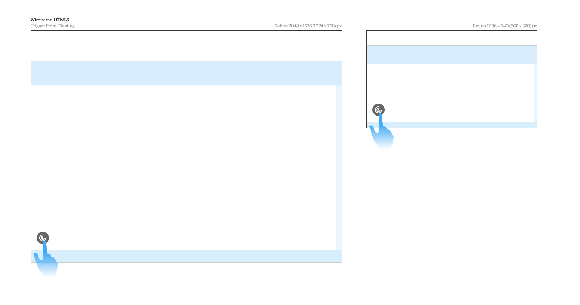
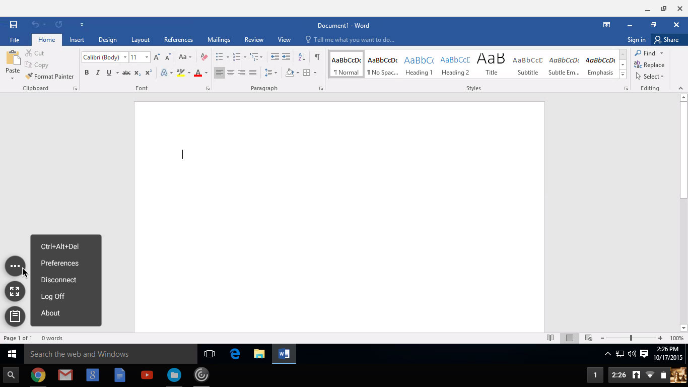
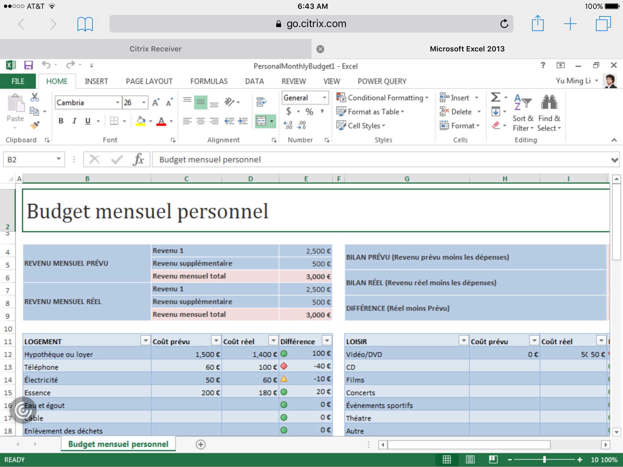
In-session controls are normally hidden until users need these. We make a trigger point on the top of virtual services, near edge, movable, and minimalist but visible. We design 2 default types:
Type (a): Snagging to edge one for non-touch enabled device, such as desktop, for precise mouse clicking and space saving;
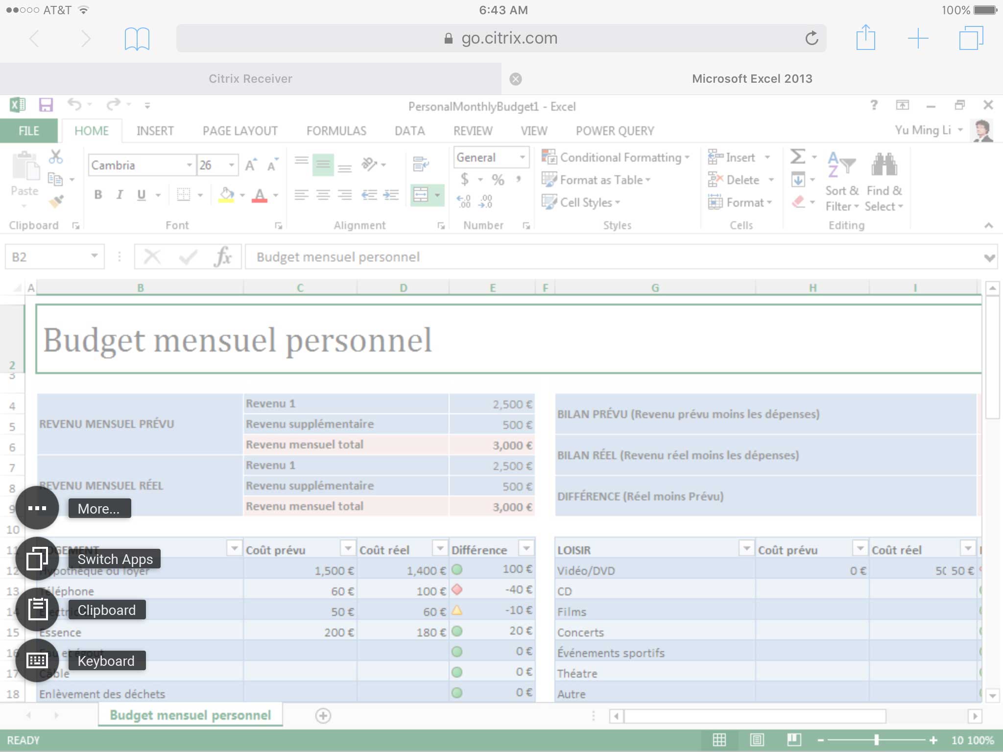
Type (b): Floating one for touch enabled device, such as mobile and “laplet”, for touch friendly.
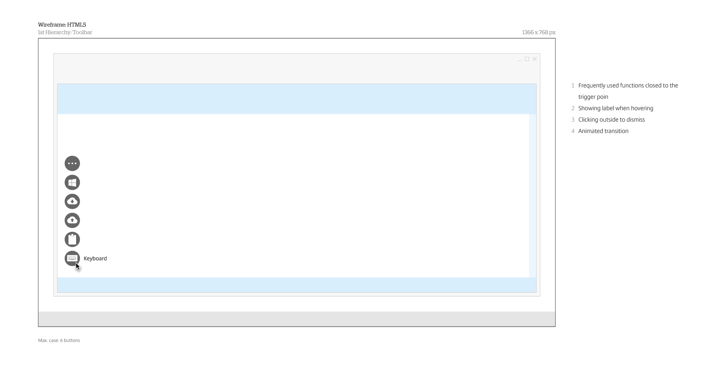
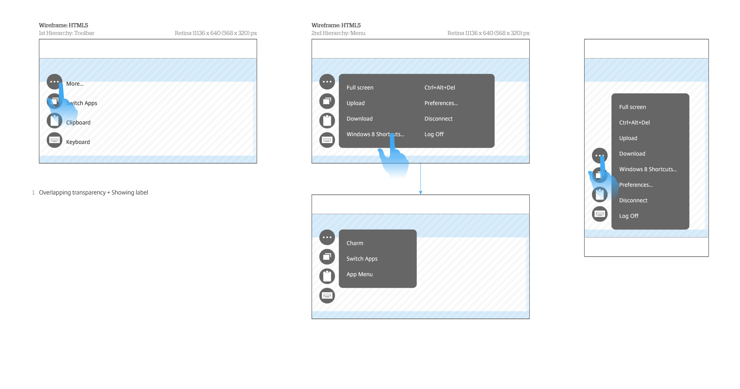
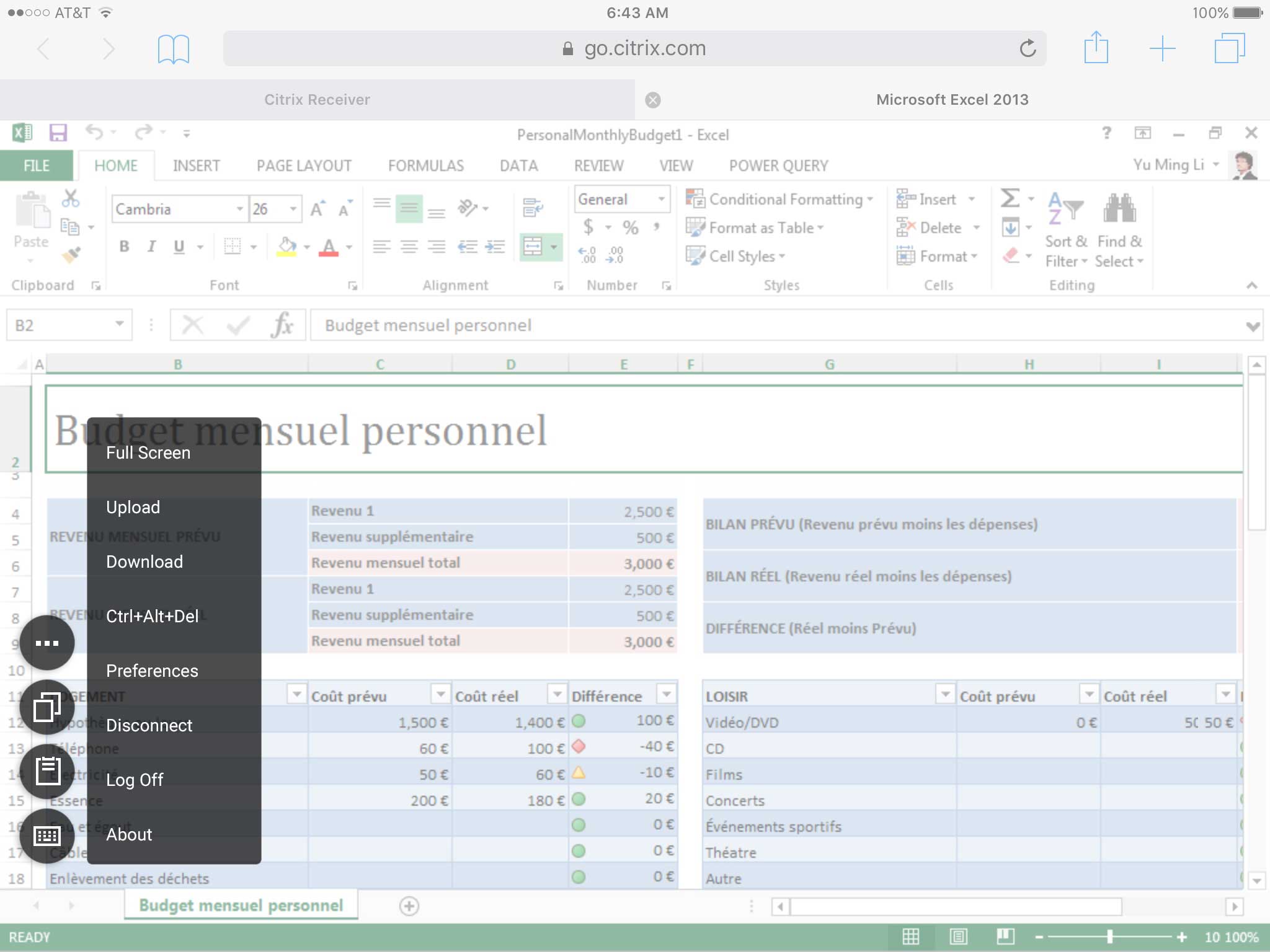
Once the controls are triggered, it extends along the edge vertically or horizontally.
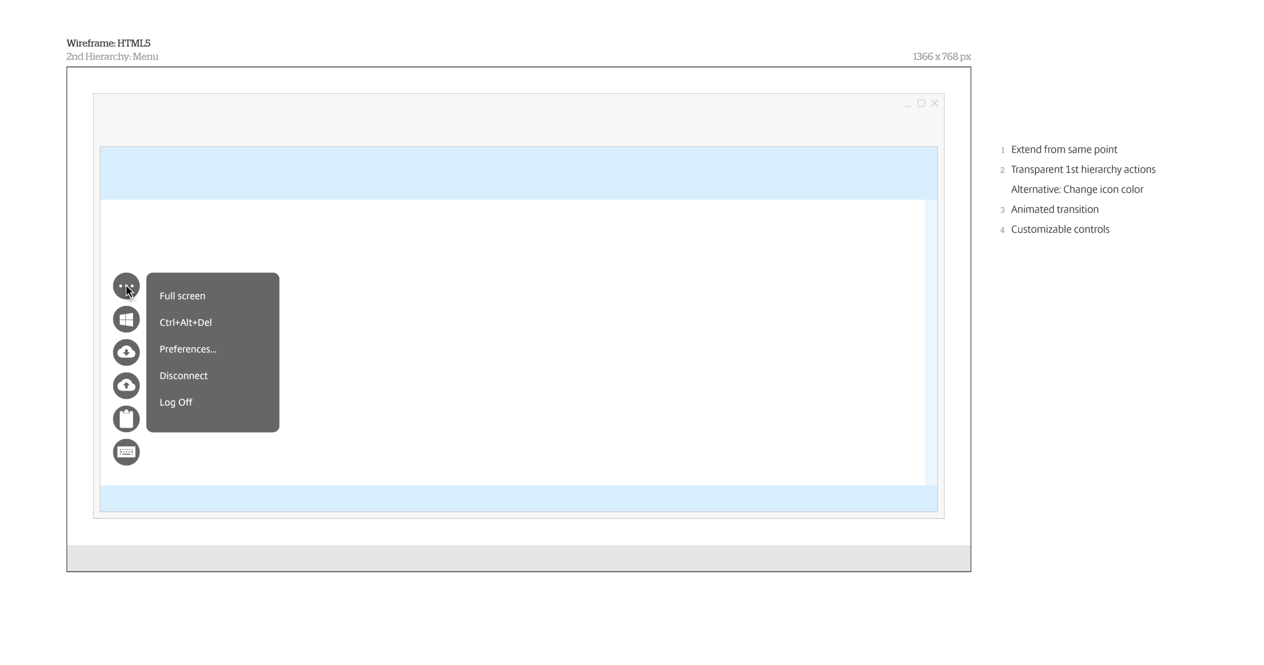
Frequently used functions are in first layer, and infrequently used ones are in a menu, which is scalable.
The controls extend from trigger point to reduce mouse cursor or finger movement. The order of function depends on usage frequency and is customizable.
Although the default types are different, these are actually interchangeable by pulling out from edge or pushing into edge.
In type (a), label presents when mouse cursor hovering.
In type (b), label presents when controls extended as no hovering behavior on mobile behavior. Also add a translucent layer on the top.
Both types are movable and apply same rules. Developers add detecting device monitor size intelligently to prevent overflow orientation.
Here are wireframes:
Connection Center

Connection Center is designed specific for seamless virtual apps on Chromebook. The “seamless” means that virtual apps will run without being accommodated in a container, just like native apps.
A tricky challenge here is that most in-session actions actually effect on an invisible desktop OS that hosts these virtual apps. In virtualization world, we call it “session”. However, most of the non-tech savvy users probably never understand it. Because the actions for apps and session are different but co-existing, we need to educate users the relationship in between when they need to take actions. The case becomes extreme complicated when multiple apps running in more than 2 sessions. Before, a contain for apps look silly but no confusion as these are grouped. Now, with seamless style, we need to let users know which app or session will be impacted on the action they take.
After couple discussions internally and externally, we proposed an ideal solution: Restructuring the Citrix Receiver menu on the taskbar.
Unfortunately, this approach relies on Google to provide API in order to customize the menu. Our product manager initiated the collaboration, but, since they doesn’t commit a timeline, we still need to come up alternative solution for our product release.
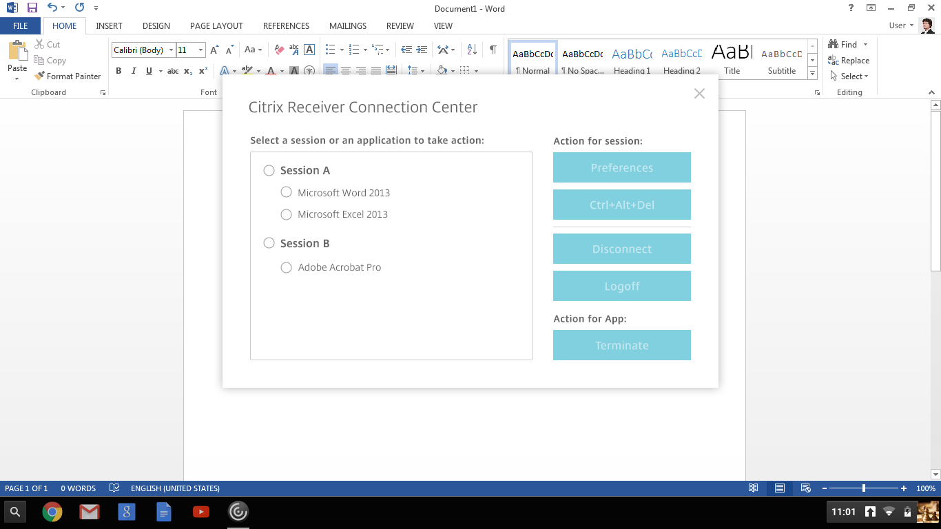
We detoured to right-click menu, which is customizable. There users can open the connection center dialog that presents the session concept and relevant actions.
Initial UI
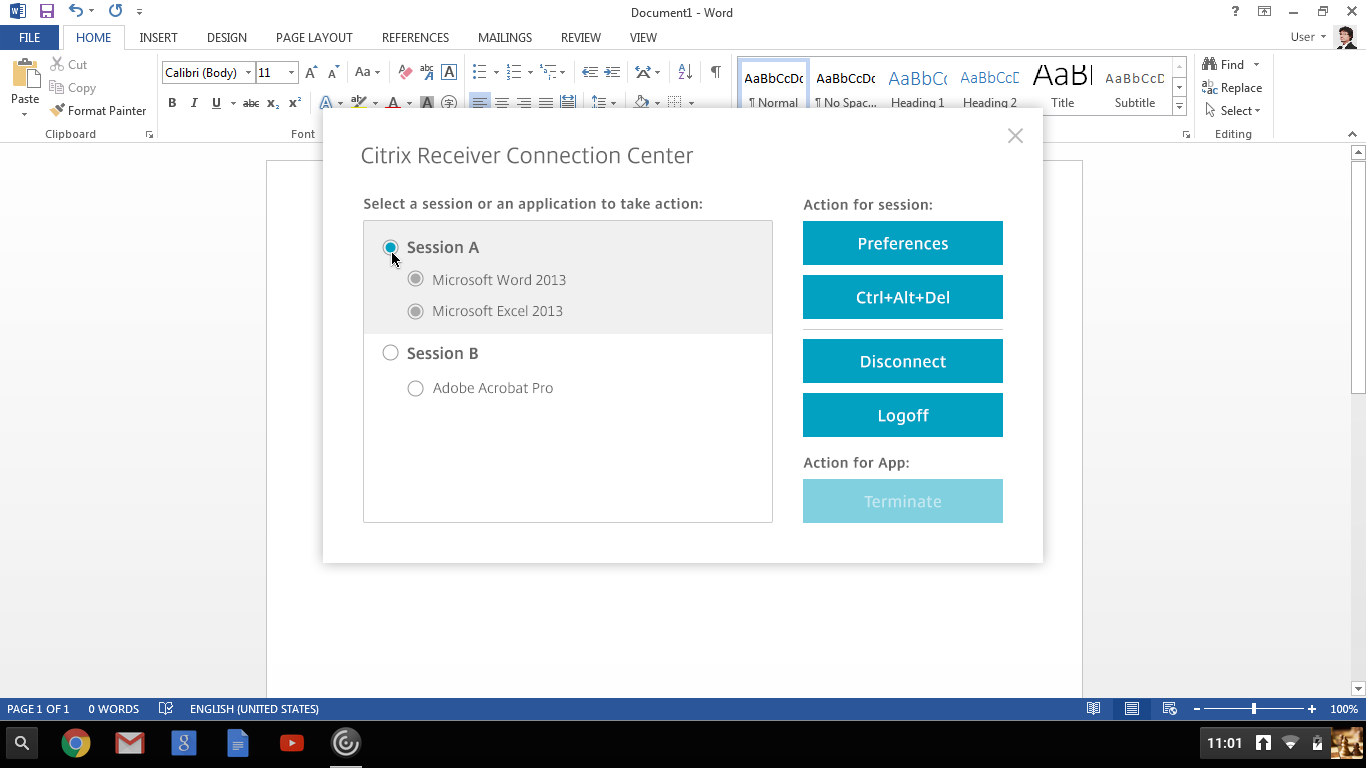
Selecting a session: This will also select the apps belong to itself automatically.
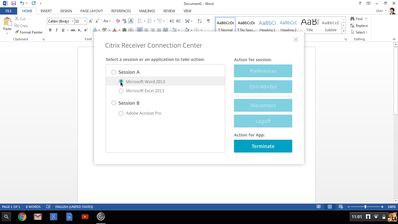
Selecting an app
Visual design provides hints, too. Highlighting area changes accordingly.
#4. Experimentation
In early ideation phase, we’ve shown high level proposals to a key customer. In that interview, the result was totally opposite from our expectation but helped us understand their needs.
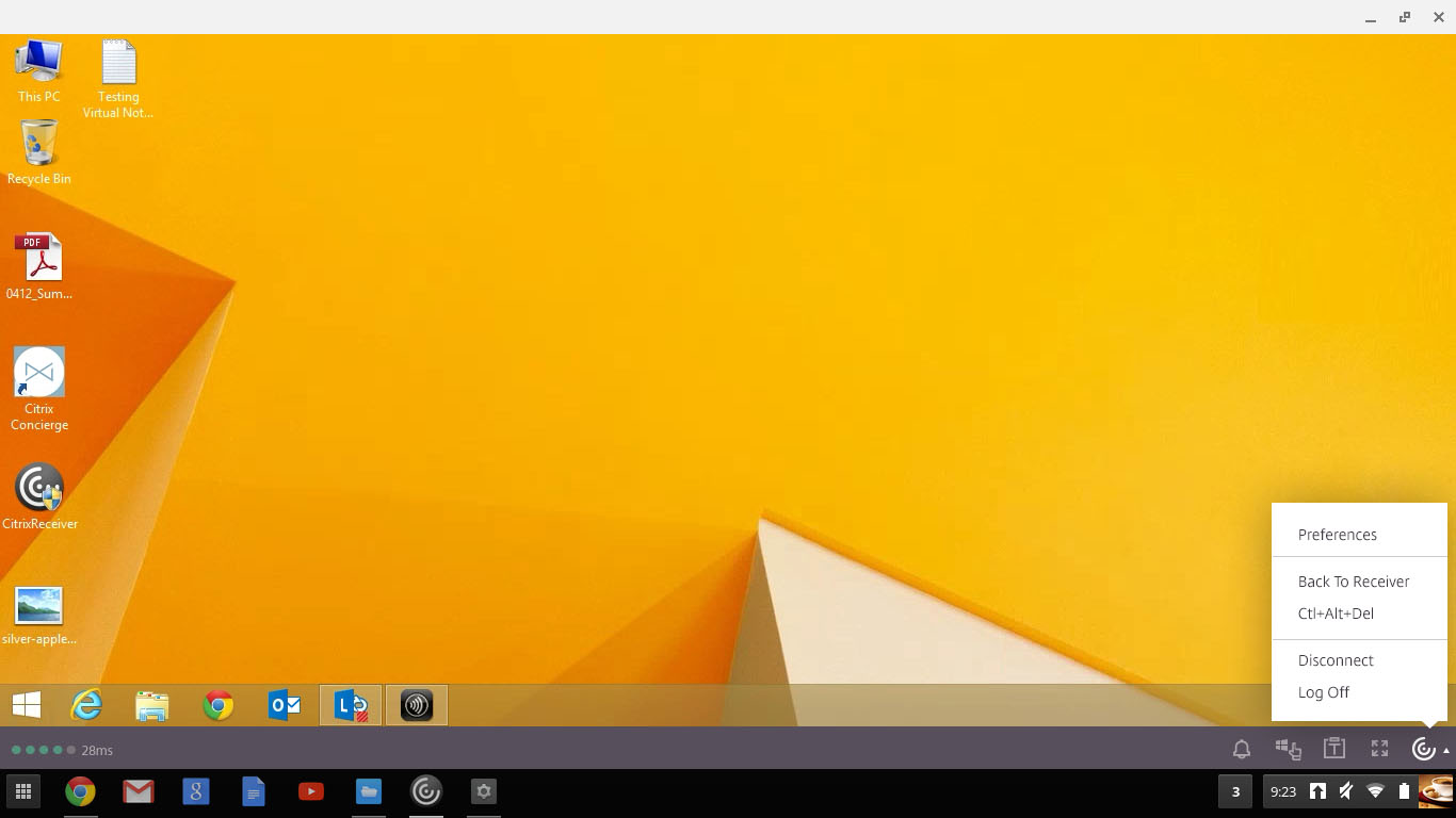
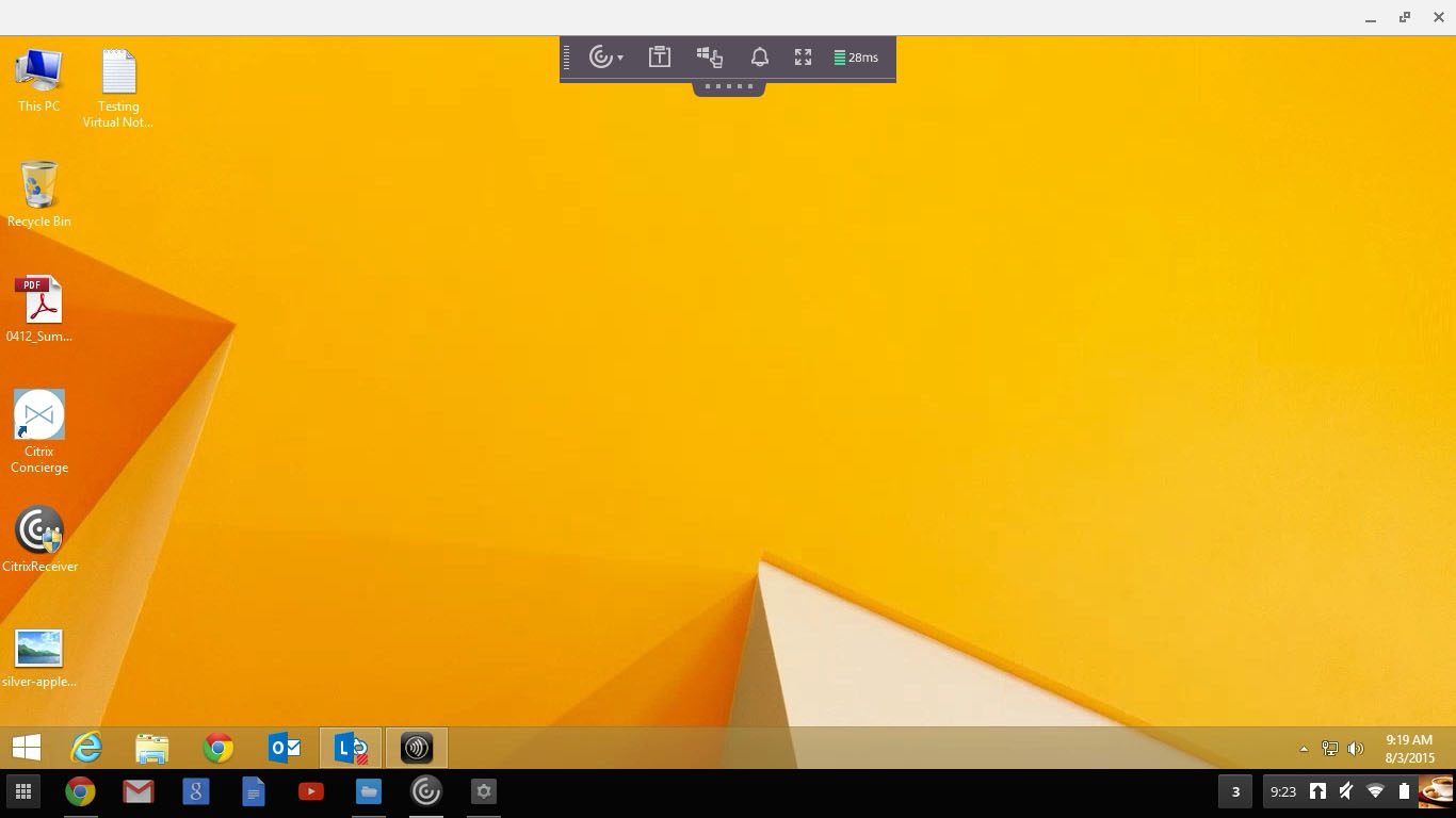
Two draft proposals: fixed and floating controls. We thought the fixed one would solve desktop and mobile use cases at once, but admins actually concerned about the spacing on limited resolution screens. Many of their users use Microsoft Excel and similar apps to deal with daily business numbers. Seeing more data maters.
In the second interviews, we proposed above in-session controls and connection center designs and validated that these match their need with many positive feedbacks.
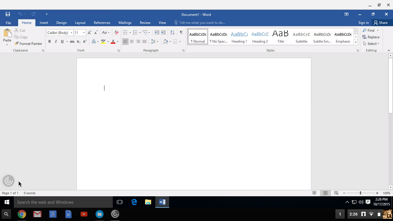
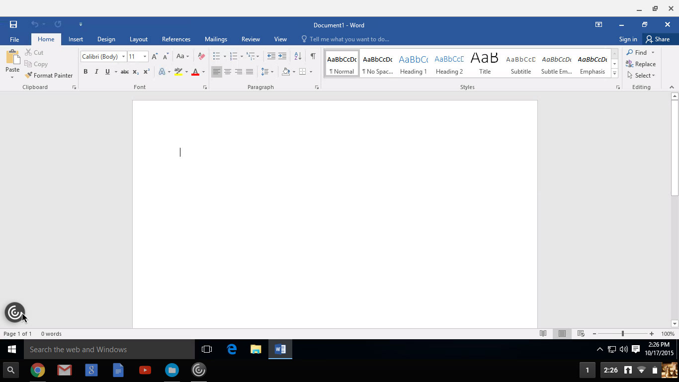
Here are mockups:
1. Citrix Receiver for Chromebook - In-session Controls:
2. Citrix Receiver for HTML5 - In-session Controls:
3. Citrix Receiver for Chromebook - Connection Center:
#5. Evolution
What will be next? We will collect data and feedbacks form customers again after the product goes live, identify new problems and then solve these.
In my design document, I listed customers’ data, such as industry, requests, problem statement, and amount of end users, as business opportunities to remind ourselves — We are designing for human beings in different context. These market evidences also motivate everyone that we are doing something impactful.
Back to the schools in Medellin city, when I think of these kids are using Citrix Receiver to access virtual desktop and apps to learn and explore digital world, I discipline myself to try hard to make every decision right.

Key takeaways
Sometimes problem isn’t as it looks like. Track to upstream to figure out how downstream is formed.
Leadership is about the things I do, not the title or authority I have. Step ahead to take lead on the whole picture.
Partnership makes collaboration easier. The first empathy we should have is to our coworkers, so that we can ally and be efficient.
I never satisfy with my design and always feel there are some areas can be improved. However, as a design lead, I have a baseline in mind and be able to make go or no-go decisions based on business/resource/impact priority.
Always teamwork! Credit to my colleagues.