Google Health — Cardiovascular UX & Health Monitoring Framework
Designing the regulation-compliant monitoring core and proactive cardiovascular intelligence for the next-generation Google Health ecosystem.
2023 July – 2025 Sep
2023 July – 2025 Sep
Launched as a standalone flagship announcement in May 2026, the new Google Health App represents the major AI-powered evolution of Fitbit. As the Lead Designer for Cardiovascular features, I navigated extreme organizational ambiguity, drove cross-functional alignment between central and feature teams under intense tension, and worked within strict medical regulations. Through this, I co-created the core Information Architecture (IA) and experience framework from Level 1 to Level 3+ UI to deliver a systemic user experience at scale.
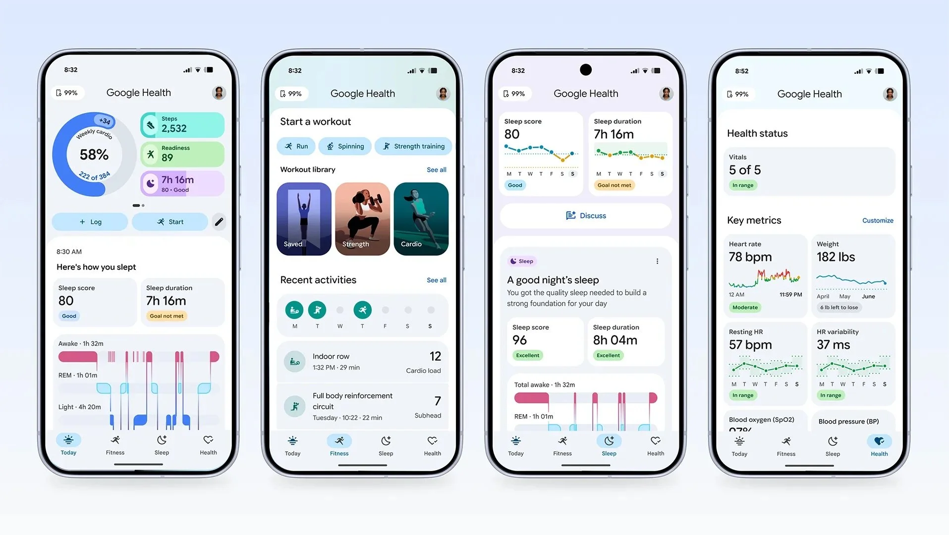
Google introduced the new Health app ecosystem, featuring the core cardiovascular tracking and monitoring systems [left screen].
✦
✦
Through foundational research, the team identified three primary user profiles for the Personal Health Agent (PHA): Seekers, Regulars, and Enthusiasts.
Despite disparate health goals, all faced one critical bottleneck: Health insights were missing in overloaded data. Connecting multiple devices—smartwatches, blood pressure cuffs, glucose monitors, and possibly more personal or sport devices—paralyzed users with massive datasets. They didn’t just need more data; they needed contextualized insights. Our research surfaced four essential product opportunities:
Discoverability: Bring life-saving features out of deeply buried menus.
Feature Status: Relieve anxiety by clearly showing that background health monitoring is active.
Affirmative Data: Deliver peace of mind when metrics look great for a prolonged period.
Urgency-Based Delivery: Re-architect notifications so life-threatening signals cut through the noise, while non-urgent trends remain non-intrusive.
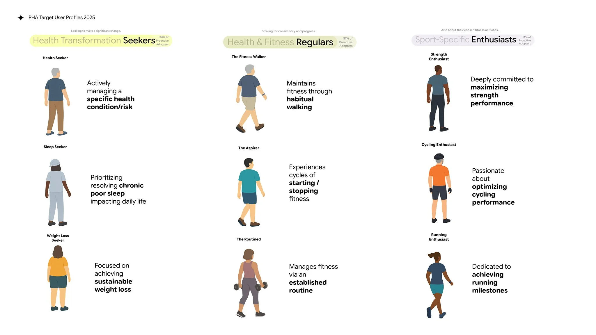
Proactive Adopter User Profiles — Seekers, Regulars, and Enthusiasts
This project spanned multiple years and inherited a fragmented legacy. When I stepped in, executive leadership direction was highly ambiguous, as the organization was still defining the boundaries of an "AI Personal Health Agent."
To break the gridlock, I proactively engaged key stakeholders and drove alignment through design conviction and structured iteration loops:
Building connections and knowledge: Conducted 1:1 stakeholder interviews across clinicians, product leads, legal counsel, tech leads, and multi-disciplinary UX teams across Fitbit, Pixel Watch, and Android Safety to map out competing priorities.
Driving consensus through co-designs: Instead of exhausting teams with long Design Sprints, I facilitated a series of short, high-impact workshops. This brought together xFN partners from both central and feature teams (Sleep, Exercise) to align on a shared vision and explicitly define what Gemini can vs. cannot safely do.
Iterating throughout execution: Constantly designed, reviewed, and iterated with xFN partners on edge cases until a cohesive UX framework was established.
We had to consolidate a dizzying array of legacy metrics from Nextbit, legacy Google Fit, Pixel and Android Safety features (*see Appendix). Initially, there was no consensus on how to group these features without overwhelming the primary user interfaces.
My Action
I spearheaded a comprehensive feature analysis to bucket every biometric signal based strictly on medical urgency. I then shared, iterated, and secured alignment with PMs and product leads across different business units.
The Solution
We established a tiered feature hierarchy based on three levels of urgency:
Life-threatening emergency assist.
Potential serious health issues requiring medical attention.
Non-urgent information warranting monitoring or discussion with a doctor.
This foundational sorting allowed us to define standardized, corresponding systemic actions for each feature group.
✦
✦
An intense design conviction gap existed between the feature team and central team—who prioritized extreme minimalism and wanted to tuck all health metrics under a generic "You" tab (4th tab alongside Today, Fitness, and Sleep). As the UX lead for Cardiovascular health, I knew through extensive research that users needed an explicit, optimized space to monitor unique medical use cases.
This tension introduced two critical friction points:
Inconsistent feature touchpoints, notification mechanisms, and treatments across the app.
The UX challenge of visualizing multiple data sources with completely different sampling frequencies in a single, intuitive chart.
My Action
I partnered with researchers to run rapid usability studies to evaluate our concepts. Armed with UXR insights, I led a heavily debated proposal to prioritize critical notifications on the main "Today" tab, while carving out a dedicated home for health monitoring features in the “You” tab. To scale this impact, I continuously collaborated with other feature teams to advocate for renaming and restructuring the "You" tab into a prominent, dedicated "Health" Tab, instead of a generic “You” tab.
The Solution
We established a clear IA and interaction paradigm across all health monitoring features:
Critical Health Notifications: Urgent events (such as IRN) now display across the Pixel Watch, Android OS (utilizing non-disclosure notifications for HIPAA compliance), and the top of the app home screen, intentionally overriding chronological order. Crucially, while applying the new visual style to these existing SaMD features (ECG and IRN), I meticulously maintained the FDA-cleared flows, UI structures, components, and copy—effectively bypassing a multi-month regulatory re-submission bottleneck.
Longitudinal Metric Changes: Significant shifts in important metrics (such as HRV) are displayed contextually within the Today tab event feed, allowing users to converse with the agent for deeper understanding.
The Dedicated Health Dashboard: The newly established Health tab serves as a glanceable dashboard, displaying less critical metrics and active feature statuses to deliver peace of mind. This innovation evolved the charts from static daily metrics into a comprehensive weekly view featuring a "personal range"—allowing users to instantly understand where their biometrics are trending.
Multi-Data Visualization Framework: I initiated a design exercise to address disparate data sampling frequencies and consulted Material Design Charting and Accessibility experts, co-designing a unified multi-data charting framework in Level 2+ alongside the central charting team.
In regulated medical software, wording is a legal liability. We had to strictly avoid sensitive terms like "alarms" or "monitoring" for user-facing surfaces, which cross the FDA’s boundary between General Wellness and Software as a Medical Device (SaMD). We also faced immense ambiguity regarding where Generative AI could be safely utilized.
My Action
I mapped our features against the FDA’s Digital Health Categories, analyzed Gemini’s clinical safety boundaries, and collaborated closely with UX Writers, Human Factors Engineers, Legal counsel, and PMs to co-create compliant terminology and structure AI output rules.
[Image: AI output structure for General Wellness]
The Solution
Together, the team structured a rigorous AI copywriting matrix:
SaMD Features (ECG/IRN): Completely restricted Gen AI, utilizing only pre-populated, FDA-approved messages.
General Wellness Features: Granted AI flexibility to generate warm, conversational behavioral summaries, transforming complex health terminology into easily understandable language. We also validated this approach through several user studies.
Status Indicators: Integrated explicit feature status indicators so users instantly knew whether background tracking was actively running or paused.
Following intense internal testing phases (Internal Dogfood and public Betas), the experience framework launched globally, culminating in its global official launch and widespread tech media coverage. Evaluating the post-launch reality with radical candor, real-world community discussions and media reviews validated our core architectural choices while providing vital feedback for the next product iteration.
Structural Clarity: Users highly praised the new 4-tab layout, specifically celebrating that "Health" and "Sleep" received their own dedicated domains. Long-term reviewers on Android Central noted that this structure makes diving into specific metrics significantly better than the legacy layout, directly validating the xFN alignment I led to establish a permanent, reliable anchor for user vitals.
Accessible Insights: In community discussions like Reddit's r/fitbit, non-athlete profiles ("Regulars") shared appreciation for how the agent successfully translated complex medical metrics (HRV, SpO2) into encouraging, layman terms, lowering the barrier to health literacy.
The Market Friction: A widespread user survey on Android Authority revealed that over half of users felt the text-heavy AI insights on the Today tab occasionally crowded the interface, reducing the quick glanceability of raw, hard metrics. While we proposed visualizing data dynamically within the AI output, the underlying tech capability was not yet mature enough to support it.
The UX Learning: This real-world community feedback confirmed that when a central platform leans too heavily into text-driven minimalism, it risks cognitive fatigue. However, our urgency-based IA progressively mitigated this—it kept critical health notifications from jamming the primary Today feed and visualized metrics and insights in simple charts whenever applicable.
The foundational platform framework established during this project paves the way for the next era of personal health management. Future phases are positioned to scale deeper ecosystem expansions, including longitudinal multi-year trend analytics, automated doctor-appointment preparation dashboards, and enhanced notification follow-up systems to ensure long-term user health.